Want to share your favorite tracks or current jams with friends on Discord? This guide walks you through exactly how to link Spotify to Discord so your music becomes part of the conversation.
As a bonus, we’ll spill the tea on how Replug can help amplify your Spotify presence even more.
Let’s begin connecting!
Maximize marketing ROI
by transforming ordinary URLs into branded short links that convert.
Try Replug for free
Why link Spotify to Discord?
Linking Spotify to Discord is a simple way to display what you’re listening to, connect over music with friends, or even sync up using the “Listen Along” feature. Whether you’re an artist, podcaster, or casual listener, integrating the two platforms adds a new dimension to your Discord presence.
Step-by-step: How to link Spotify to Discord
Let’s walk through the exact process of how to link your Spotify to Discord in just a few clicks.
Now you know exactly how to link Spotify to Discord, share what you’re listening to, and even enjoy synchronized playback with friends. It’s a great way to add more personality to your profile, whether you’re jamming solo or connecting with your community.
Plus, if you’re looking to go beyond personal sharing and actually grow your music or content audience, tools like Replug can take your visibility even further.
FAQs on linking Spotify to Discord
How do I link Spotify to Discord?
To link Spotify to Discord, open the Discord desktop app, go to User Settings > Connections, and click on the Spotify icon. Log in to your Spotify account and authorize the connection. You can then choose to display your music on your profile or status.
How to listen to Spotify together on Discord?
You can use Discord’s Listen Along feature to sync your Spotify playback with a friend. Just click on a friend who is listening to Spotify and select Listen Along. Both users must have Spotify Premium, and it only works in text chats, not voice channels.
Why doesn’t my Discord show my Spotify?
Make sure you’ve correctly linked your Spotify account in User Settings > Connections, and enable both:
Display on profile
Display Spotify as your status
If it’s still not showing, try disconnecting and reconnecting your account or restarting the app.
How to listen together on Spotify?
Outside of Discord, Spotify offers a feature called Group Sessions (for Premium users) that lets you listen together with friends in real time. Within Discord, the Listen Along feature achieves the same effect when both users are connected and using Spotify Premium.
Is Spotify Premium required to link Spotify to Discord?
No, you don’t need Premium to link Spotify to Discord or display your status. However, you do need Spotify Premium to use the Listen Along feature with friends.
Can you link Spotify to Discord on mobile?
No. Currently, the Spotify connection setup must be done through the Discord desktop app. Once linked, your music status can be viewed across devices, but initial linking isn’t supported on mobile.
The sky? Calm? Maybe “Monday blues”, or something cool and refreshing?
Now think “Red”.
How do you feel?
In danger? Energized? Bold? Maybe even a little anxious?
See what just happened?
Colors don’t just look different; they feel different. They shape how we perceive, react, and decide. In marketing, that’s where color psychology steps in. It’s a quiet force, often overlooked, but it speaks louder than you might think.
And that brings us to a crucial question: Can something as small as your call-to-action button color really influence clicks?
YES! It can.
At first glance, it might seem like a minor design choice. But it’s not. Color quietly guides what users notice, how they feel, and what they do next. The numbers back this up: 60% of people decide whether to accept or reject a product based on color alone. And consistent brand colors can increase recognition by up to 80%.
But what makes a CTA button color work?
Is it as simple as using red for urgency and blue for trust? Or is there more behind the choices?
In this blog, we’ll explore what color psychology tells us, share real-life CTA button examples, and talk about how to choose colors that fit your brand and audience.
Boost your conversion rates with irresistable CTAs with
Why call to action button color matters for website conversion
When you’re working to improve website conversion, it’s easy to focus on things like copy, layout, or adding eye-catching visuals. But, your call to action button color can quietly play a bigger role than you might expect. After all, your CTA button isn’t just a design element; it’s what guides your visitors toward the next step, whether that’s signing up, buying, or learning more.
Colors influence what catches our eye first, how we feel about a brand, and how confident we feel about taking action. Research suggests that colors can even affect our heart rate, sense of urgency, and trust, all of which directly impact conversion optimization efforts. That’s why something as small as a CTA button can help increase CTR and maximize your conversion rate when chosen thoughtfully.
Think of it like this: your CTA button is the tipping point between browsing and converting. And while great copy helps, the right color makes that message stand out.
Just imagine a bold orange “Start free with email” button on a white landing page. It’s almost impossible to miss, isn’t it?
Choosing a color that contrasts with your background, fits your brand, and aligns with your audience’s preferences can make all the difference.
Now, let’s look at call to action button color psychology and explore how certain colors can trigger specific emotions and behaviors.
Call to action button color psychology: How colors influence user behavior
Call-to-action buttons may look simple, but there’s deep psychology behind what makes people click. Colors tap into emotions, perceptions, and even gender or cultural preferences. For instance, research shows women often prefer purple, green, and blue, while men lean toward blue, green, and black.
But choosing the right color isn’t just about emotion. It’s about strategy.
Your button must stand out from the background, reflect your brand tone, and stay consistent across your site. A color that pops in one layout might fade in another. A bold red may scream urgency on a white background but vanish into a dark hero image.
Also, cultural context matters. White means mourning in China, while in Greece, it’s purple. Brand identity plays a role too: playful orange might feel off on a luxury brand, while elegant black could be too intense for a kids’ site.
In short: color doesn’t just decorate, it directs. And when chosen wisely, it quietly nudges users to take action.
Put theory into action with Replug
Now that you know how much a button color can impact user behavior, here’s the real question: how do you bring this to life on your own pages?
Replug has a custom CTA generator that helps you design high-performing CTA overlays and bridge pages that align with your brand. You can personalize every detail; text, colors, logos, button placement, and layout, so your CTAs feel intentional and not generic.
Whether you’re using red for urgency or blue for trust, Replug gives you full creative control to test, tweak, and convert:
Button color, size, and placement
Backgrounds, layout, and design
Targeted messaging that connects with the right audience
If you’re ready to stop guessing and start converting, Replug gives you the tools to make every CTA count.
Boost your conversion rates with irresistable CTAs with
You’ve seen how colors can influence action, but just picking red or green isn’t enough. Here are a few best practices to make sure your CTA buttons actually convert:
Contrast is key
Your button should stand out, not blend in. Make sure it contrasts clearly with the background and surrounding elements.
Stick to one primary CTA color
Don’t overload your page with multiple button colors. Choose one primary action color and stick to it for consistency and clarity.
Test what works for your audience
Color psychology is powerful, but it’s not one-size-fits-all. A/B test your CTA colors to see which one actually gets more clicks.
Use a customizable CTA generator
Use a CTA generator tool like Replug to design CTA buttons with full control over colors, fonts, and layouts. This way, your CTAs will always feel on-brand and eye-catching.
Get inspiration from the best brands
Look into how top brands craft their CTA buttons. Pay attention to color, text, and placement, and take notes on what grabs your attention.
Pair color with strong copy
Even the most vibrant button won’t convert if the copy’s vague. Use action-driven text like “Get Started”, “Try it Free”, or “See How It Works.”
Make it mobile-friendly
Your CTA should be big enough to tap and look just as good on mobile screens as it does on desktop.
Now that we’ve doubled down on why the color of your call-to-action button matters and how to customize it using Replug, we’ve handpicked some of the best CTA button color examples for you. These real-world examples will give you a visual understanding of how different colors guide user perception, and how smart brands use them to drive clicks, signups, and sales.
Ready to pick your favorite?
Scroll down and see which CTA makes you want to click!
10 best call to action button colors (and when to use them)
So, what is the best call to action button color?
Marketers, designers, and honestly, entire Slack channels have debated this endlessly. But the answer isn’t as simple as “red always wins” or “blue builds trust.”
Let’s break it down, color by color, with what psychology and research actually tell us:
1. Red: urgency, excitement
Red is bold, loud, and great when you need to shout. It sparks urgency, perfect for flash sales, limited-time offers, or “Get Started” buttons. Also, red has been shown to increase heart rate.
When to use: Short-term offers, countdowns, or high-energy campaigns where you want quick clicks.
When to skip: If your brand is about calm, trust, or luxury, red might feel too aggressive or stressful.
Examples:
Coca-Cola:Shop Collection — red evokes excitement and brand passion.
Netflix:Get Started — red hints at bold entertainment and immediacy.
Green is reassuring. It whispers “Go ahead, it’s safe,” which is why it’s often used on checkout buttons or anything health-related. It’s tied to nature, wellness, and even prosperity.
When to use: Moments where you want users to feel comfortable and reassured as they take the next step.
When to skip: If your site already has a lot of green, your button might fade into the background.
Examples:
Postnitro:Start creating free carousels — calm encouragement to begin.
Evernote:Get Evernote free — signals progress with a peaceful touch.
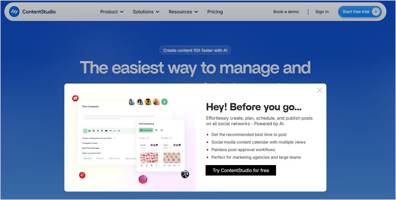
Blue is a crowd favorite. 57% of men and 35% of women rank it as their top color. It feels secure, stable, and reliable, which is why banks, SaaS tools, and corporate sites love it.
When to use: Professional services, information-heavy sites, or brands built on credibility.
When to skip: In food-related spaces (blue can suppress appetite) or when you want a more emotional, warm vibe.
Examples:
Replug:Get your short link for free — stable, reliable call to action.
ContentStudio:Start your free trial — builds user confidence.
Orange is energetic and playful, combining red’s urgency with yellow’s cheerfulness. However, about 29% of people rank orange as their least favorite color. It can feel cheap or off-brand in serious contexts.
When to use: Playful brands or when you want fast engagement without feeling too aggressive.
When to skip: Luxury products or serious industries where a more premium feel is needed.
Examples:
HubSpot:Get a demo — warm and inviting for curious prospects.
The Budgetnista:Take the 60 sec quiz — quick and casual engagement.
5. Yellow: Bright, optimistic, and grabs attention
Yellow pops off the page and brings a sunny, cheerful energy. It’s hard to miss, which is great for catching eyes. But too much yellow can feel overwhelming or even cautionary, like a warning sign.
When to use: Secondary actions, highlights, or to draw attention to updates and offers.
When to skip: As your main CTA color. It can strain the eyes or create tension if overused.
Examples:
charity: water:Join now — optimistic urgency for a cause.
Mailchimp:Start preview — energetic but not overwhelming.
Black buttons look powerful and stylish, especially for fashion, luxury, or tech brands. About 28% of famous companies use black as their brand colors for a cutting-edge feel.
When to use: Premium product lines, minimalist designs, or when you want to add weight to your button.
When to skip: Friendly, casual brands or spaces where black might come off as too harsh or impersonal.
Examples:
Contentpen:Start with 3 free articles — sharp and direct.
Typeform:Get Started — it’s free — stylish and professional.
Grey doesn’t compete for attention, making it ideal for secondary actions. It’s balanced and professional but easily blends into the background if not used carefully.
When to use: Supporting buttons, disclaimers, or actions that don’t need the spotlight.
When to skip: As your main CTA color, it can feel dull or signal a disabled state.
Examples:
Canva:Read more — clear, but not dominant.
Etsy:Shop these unique finds — blends into a creative backdrop.
White lets other design elements shine. It creates a sense of space and minimalism when used well. But too much white can create visibility issues, especially with low-contrast backgrounds.
When to use: High-end, airy layouts or when your background is dark and you need something that pops.
When to skip: White-on-white designs or when the overall feel risks being too sterile or lifeless.
Examples:
M&M’s:Personalize your M&M’S — lets color pop on the page.
Apple:Watch the clip — sleek, distraction-free experience.
Warm colors like red, orange, and yellow can create urgency and excitement.
Cool colors like blue, green, and black often build trust or feel premium.
There’s no single “best color,” only the best choice for your brand, audience, and context.
What experts say about CTA button colors and conversion optimization
If you search online for the “best call to action button color”, you’ll quickly find lots of strong opinions, and sometimes, conflicting advice. Some marketers swear by red for urgency. Others love green for its calm and positive feel. And plenty argue that blue builds the most trust.
So, who’s right?
Experts often fall into three camps when it comes to conversion optimization:
The generalizers: They share broad best practices, like “warm colors grab attention” or “contrast your button against the background.” These tips help, but they don’t always explain why certain colors resonate more with specific audiences.
The pigeonholers: They believe there’s a secret formula, a single “winning” color that always boosts conversions. But, what works for one brand or campaign might not work for another.
The perpetual testers: They focus on experimenting over and over. For them, there’s no one-size-fits-all answer. The real key is trying different button colors, tracking what drives clicks, and refining based on results.
The truth is, your call to action button color does matter, but context is everything. Replug users often run A/B tests on their landing pages to see which one performs best – and call to action button colour can be a potential variable as to why only one landing page is worth keeping.
For instance, some audiences might click more on a bold orange “Learn More” button, while another responds better to a calm blue “Get Started.” This testing-first mindset is what often helps brands increase CTR and see the real impact of color on your conversion rates.
There isn’t a single color that works perfectly for every product or audience. Instead, it’s about choosing a color that fits your brand, contrasts well with your design, and feels right to your target users.
Wrapping it up
The right CTA button color can catch the eye, stir emotion, and even nudge someone to click.
But there’s no one-size-fits-all formula.
Your brand, audience, and goals should guide your palette. Want trust? Try blue. Need urgency? Red might do the trick. Going for luxury? Maybe black.
So, test, tweak, and trust your data. And don’t be afraid to break the “rules” if it works for your people.
Because at the end of the day, it’s not just about color psychology; it’s about connection.
Boost your conversion rates with irresistable CTAs with
There’s no fixed palette, but popular CTA button colors include red (urgency), green (go), blue (trust), orange (excitement), and black (luxury). The best color depends on your brand vibe and what action you want people to take.
What is a good color for a button?
A good button color stands out from your background and matches your message. Red and orange work well for urgent actions, while green and blue feel more calm and trustworthy.
What color attracts people to click?
Red and orange tend to drive the highest click-through rates in many tests. But ultimately, the most “clickable” color is one that contrasts well and aligns with user expectations on your site or campaign.
What is call-to-action button color psychology?
CTA button color psychology is the study of how different colors influence people’s decisions to click. For example, red can create urgency, blue builds trust, and green signals success. Choosing the right color can improve conversions—when done with context in mind.
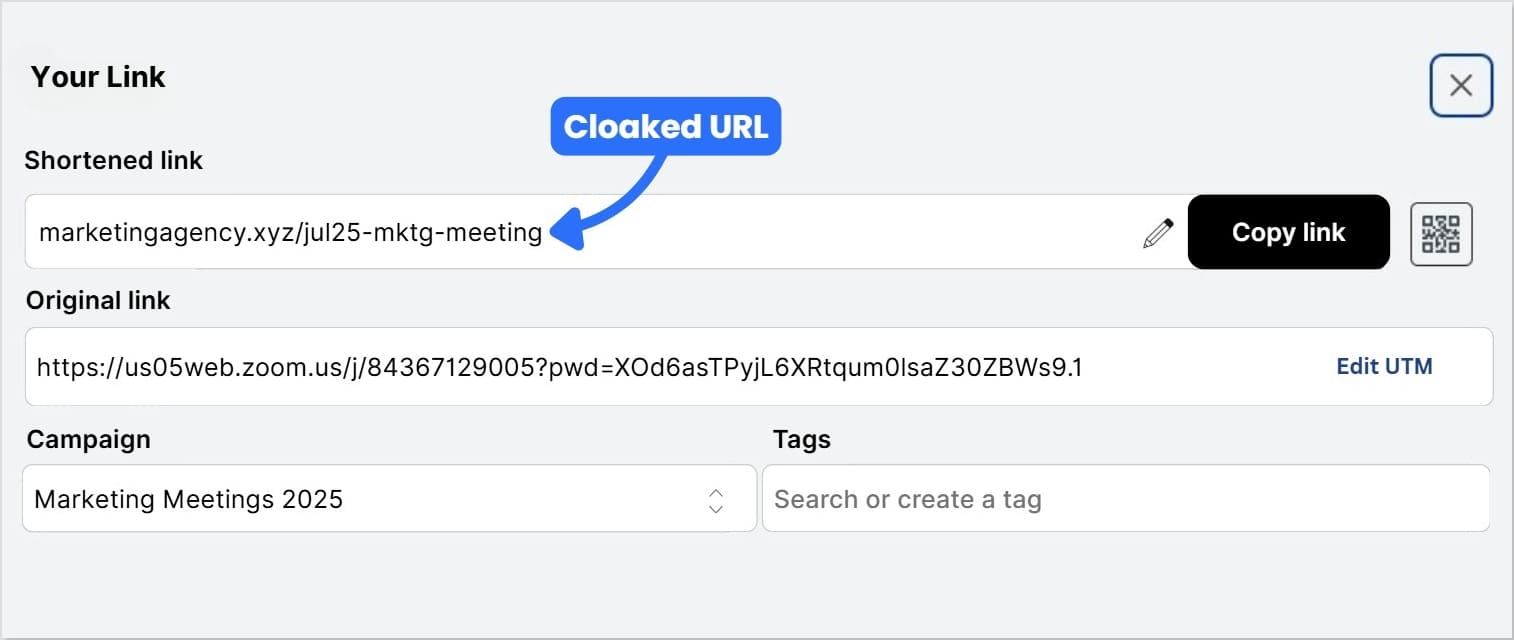
When it comes to cleaner, more trustworthy links, marketers and affiliates often face the choice: link shortening vs link cloaking.
They might seem similar, but each serves its own purpose. Knowing the difference can help protect your affiliate income, improve branding, and boost engagement.
In this post, we’ll explain:
What they are
How each works
Why they matter
What’s the difference between them
When to use them
And why tools like Replug do more than your average link shortener
Even if you don’t know what “link shortening” and “link cloaking” means, this guide is for you.
Boost ROI with branded URLs!
Enhance your marketing campaigns by creating shareable, trackable, and fully multi-purpose
customizable branded URLs.
Let’s say you run an Instagram account for product reviews. You want to share an affiliate offer.
Your raw link might look like this:
We won’t recommend this because:
It looks spammy (people ask, “Where will this take me?”)
It’s hard to read or remember
It breaks in text messages or emails
It reveals your affiliate ID, and someone could strip it out
Has UTM parameters, which might confuse users
It’s impossible to say out loud in a video or podcast
This is why link shorteners and link cloaking tools exist: to help you create secure branded links.
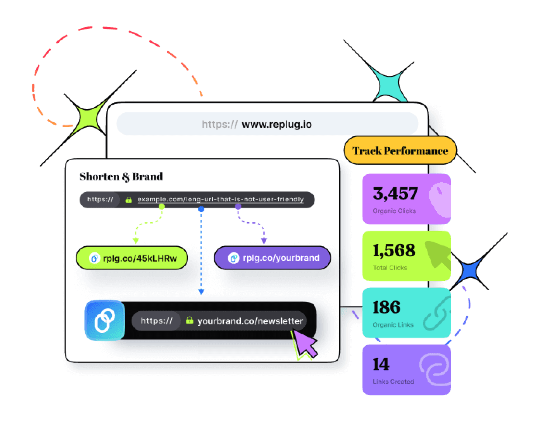
What is link shortening?
Link shortening is the process of turning a long, complex destination URL into a clean, short url that’s easier to share. The shortened URL redirects to the original destination URL, so users still land exactly where you want them.
For example:
becomes:
The process is quick and handled by a link shortening service or URL shortener like Replug.
How link shortening works (and why it matters)
Link shortening isn’t complicated behind the scenes, but it helps to know how it works.
When you shorten a URL:
You enter your long link into a link shortening service like Replug
The URL shortener or link shortener generates a short URL
When someone clicks, the short URL redirects them to the original destination URL
This process is quick, and the user rarely notices the redirect. Plus, with tools like Replug, your shortened URLs don’t have to look random; you create branded links as well.
Benefits of link shortening
Link shortening isn’t just about making URLs look nicer. Here are a few benefits:
Better user experience: Shortened URLs are easier to read, share, and remember.
Improved trust: Branded short URLs look more professional than long affiliate URLs.
Updatable anytime: Easily change the destination URL later without changing the short URL.
Tracking & analytics: See how many people clicked, where they came from, and what device they used.
Concise messaging: Fits well in social media posts, SMS, email, and print materials.
Using a reliable link shortening tool like Replug also helps keep your shortened URLs active and secure.
What is link cloaking?
Link cloaking goes beyond shortening, and is especially useful for affiliate marketers. It creates a branded, shortened URL that disguises the actual destination URL. When users click your cloaked URL, they still see your branded link in the browser bar, rather than your raw affiliate URL. That’s why it’s also called link disguising or link masking.
For instance, an affiliate URL like:
could be cloaked to:
How link cloaking works (and why it matters)
Link cloaking sounds complex, but it’s actually simple once you see what’s happening.
When you cloak a URL:
You enter your long affiliate link (or any destination URL) into a link cloaking tool like Replug.
At first glance, both seem similar because they make URLs shorter and cleaner. But the difference between link shortening and link cloaking is in how they handle the destination URL and what they’re used for.
In short: All cloaked URLs are shortened, but not all shortened URLs are cloaked.
Controversy around link cloaking
Some platforms see link cloaking as deceptive because it hides the real destination. This can affect trust if the user feels misled.
But when used transparently, for example, to protect your affiliate ID while still sending users to a relevant page, it’s ethical and widely accepted. Replug helps here by letting you cloak affiliate URLs without hiding intent. Your links look professional, stay on brand, and are trackable, so your audience still knows they’re clicking a trusted link.
How to know which one to choose, and when?
Link shortening vs link cloaking isn’t always about picking one. It’s about what fits your campaign.
Rotating links to show different offers in different places.
If you only need shorter, cleaner URLs for your own content, basic link shortening is usually enough. But if you’re sharing affiliate URLs, need to mask the destination and protect your ID; link cloaking is the smarter choice because it already combines branding, shortening, and protection in one link.
Why Replug does more than basic link shortening services
Basic link shorteners stop at making short URLs. Replug does more:
Affiliate link cloaking: Hide affiliate URLs behind branded links.
Advanced analytics: Track total and unique clicks from devices, locations, referrals, and OS.
QR codes: Generate customizable, dynamic QR codes that can be tracked
Retargeting: Add retargeting pixels to your short link to bring back lost customers and reduce cart abandonment.
Call-to-action overlays: Add CTA buttons, popups, and banners over your content
Link management: Edit destination URLs, add link expiration on seasonal campaigns, and manage your links and bulk download them all within a single dashboard
SMS links: Keep URLs short and clean so they fit character limits and look trustworthy when sent by text
Deep linking: Direct users straight into a specific app page or product screen instead of just the homepage.
Instead of just shortening a URL, you get full link management + advanced features to help links perform better.
Conclusion
Messy URLs don’t just look bad; they can kill trust, hurt clicks, and cost you affiliate commissions.
That’s why knowing the difference between link shortening and link cloaking matters:
Use link shortening to keep URLs neat and track clicks.
Use link cloaking to protect your affiliate IDs, keep branded URLs visible, and track deeper data.
For creators, affiliates, and businesses that care about trust and conversions, cloaking isn’t sneaky; it’s smart marketing. And with a tool like Replug, you get both shortening and cloaking, plus analytics, retargeting and more, all under your own brand.
FAQs on link shortening vs link cloaking
What is the point of link shortening?
Link shortening turns long, messy URLs into short, shareable ones. This makes them easier to use in social media posts, SMS, print materials, or anywhere you need clean, memorable links, while also letting you track clicks and engagement.
Is using a link shortener bad for SEO?
Not usually. A short URL itself doesn’t hurt your site’s SEO. Just make sure you’re using a reputable link shortening service (like Replug) and branded domains to keep trust high. Clean, branded links can actually improve click-through rates, which indirectly helps traffic.
How link cloaking improves mobile user experience?
Cloaked URLs are shorter, branded, and easier to read on small screens, so users can see and trust what they’re clicking. They also prevent links from breaking in messaging apps or mobile browsers, making it simpler for people to reach the intended page without confusion.
What does it mean to cloak a link?
Cloaking a link means hiding the real destination URL behind a branded, user-friendly URL. Visitors see your custom link instead of the original affiliate or tracking URL, which helps protect affiliate IDs and looks more trustworthy.
Does Replug do both shortening and cloaking?
Yes. Replug lets you create both simple short URLs and fully cloaked, branded links, plus advanced features like retargeting, call-to-action overlays, and A/B testing.
Why do affiliates cloak links?
To protect their affiliate ID from being removed, hide long and messy URLs, build trust with branded links, and sometimes add retargeting or tracking pixels. Cloaked links also look cleaner and more professional in marketing campaigns.
Does Amazon allow link cloaking?
No. Amazon’s Affiliate Program (Amazon Associates) specifically prohibits cloaking its affiliate links. It’s important to always check the Associates Program Policies before cloaking.
How do you hide your affiliate link with a redirect?
Use a link cloaking tool like Replug. You paste your long affiliate URL into the tool, create a branded, cloaked link, and when someone clicks it, they’re redirected to your affiliate offer while only seeing your clean, branded link in the browser.
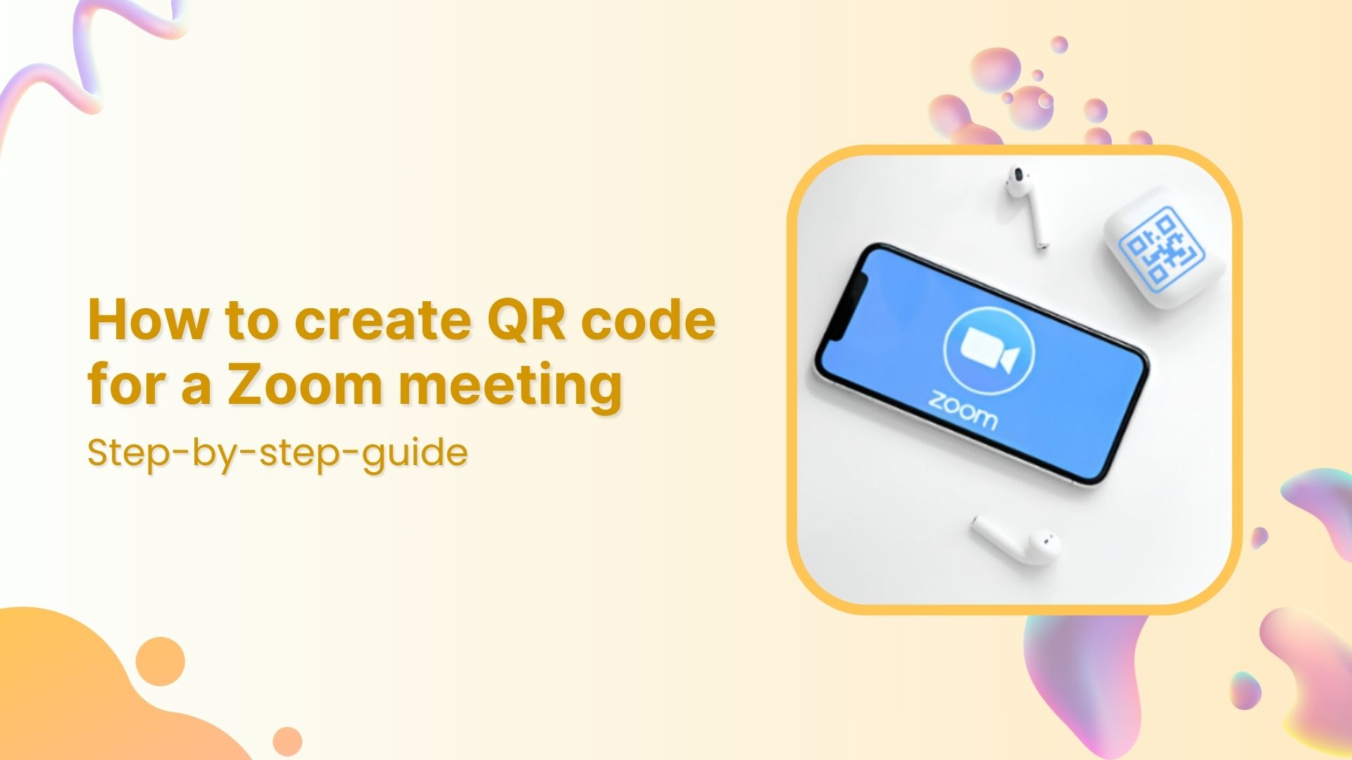
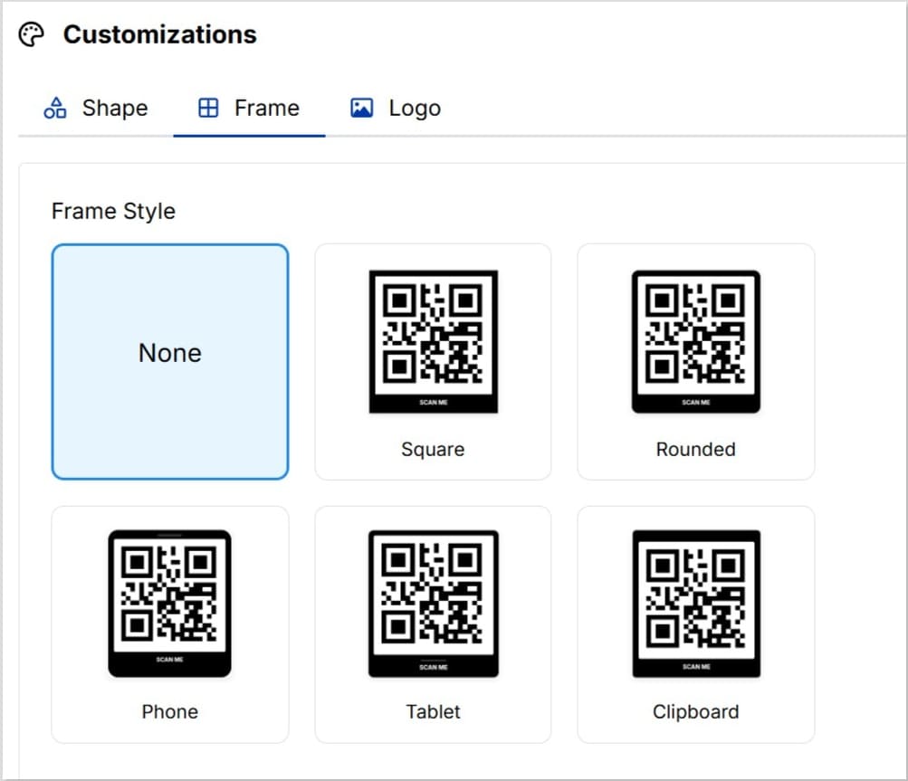
Sharing a Zoom meeting QR code makes it effortless for attendees to join. Instead of copying and pasting long URLs, participants simply scan your QR code.
A Zoom meeting QR code is especially helpful when:
Running webinars, classes, or workshops
Sharing invites on posters, slides, or printed materials
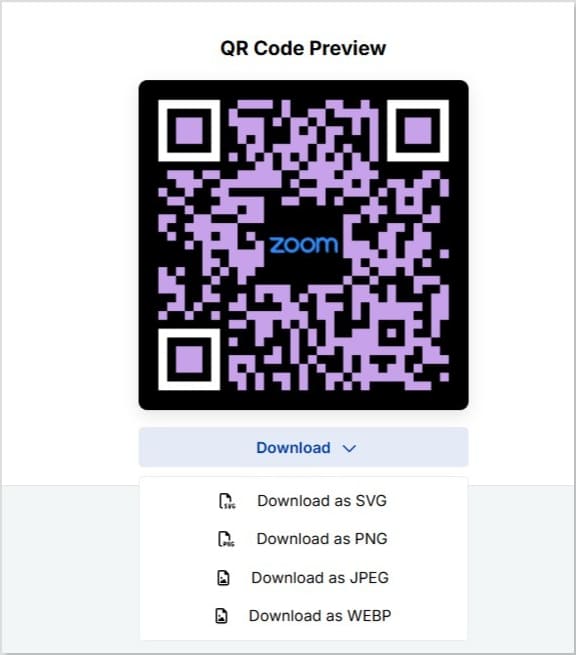
Save your Zoom meeting QR code as PNG, SVG, WEBP, or JPEG
A complete link management solution
for marketing professionals & agencies.
Try Replug for free
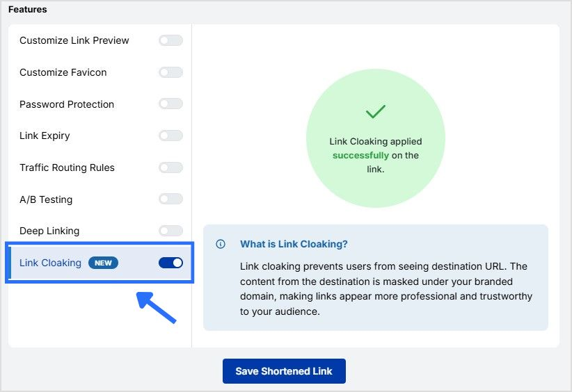
Step 6: Enable link cloaking (optional)
Zoom meeting links are long and messy, and can often get confusing for attendees. To counter this issue, Replug allows you to cloak your Zoom meeting link:
In Replug’s dashboard, locate your Zoom meeting link and click “Edit.”
Post the QR code image on LinkedIn, Facebook groups, WhatsApp, Slack, or Discord.
Add clear text like: “Scan to join our next Zoom session!” so people know what the code is for.
7. Add it to your website or landing page
If your event is public, add the QR code to a dedicated event page, blog post, or banner.
8. Use dynamic QR codes
Instead of static codes, use tools like Replug to create dynamic QR codes.
Benefits:
Edit the meeting link later without changing the code.
Track QR scans to see how many people joined through scanning.
9.Make it clear what it’s for
Always add a label or caption such as: “Scan to join Zoom meeting” “Save this meeting link”
Maximize marketing ROI
by transforming ordinary URLs into branded short links that convert.
Try Replug for free
Conclusion
Creating a Zoom meeting QR code with Replug is simple, quick, and powerful. In just a few steps, you can generate a Zoom meeting QR code that helps people join your meeting easily by scanning. With Replug, you also get customization options and scan tracking to see how your audience engages.
Start using Replug today to create custom QR codes and branded short links for all your meetings.
FAQs on how to create a QR code for Zoom meeting
How do I create a QR code for Zoom meeting?
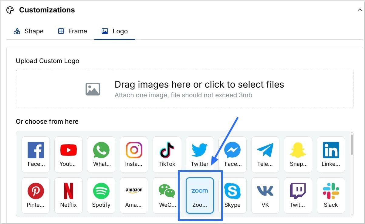
You can use tools like Replug to generate a QR code by pasting your Zoom meeting link. Customize it with your logo and colors if needed.
How do I join a Zoom meeting with a QR code?
Simply open your phone’s camera or a QR scanner app, point it at the code, and tap the link that pops up. It will open the Zoom meeting in your app or browser.
How do I generate a Zoom meeting code?
Schedule or start a Zoom meeting and copy its link. Then use a QR code generator like Replug to convert that link into a QR code.
What is the QR code for Zoom webinar registration?
A Zoom webinar QR code lets attendees scan and register for your webinar instantly. Just generate a QR code for your webinar registration link and share it online or offline.
Can I create a dynamic QR code for a Zoom meeting in Replug?
Yes. Replug lets you create dynamic QR codes so you can update the Zoom link anytime without printing a new code.
Is Replug’s QR code generator for Zoom meetings free?
Replug offers a free trial. To unlock full customization and scan analytics, you’ll need a paid plan.
Can I track scans of my Zoom meeting QR code?
Yes. Replug’s dashboard shows detailed scan analytics, including the number of scans and where they happened.
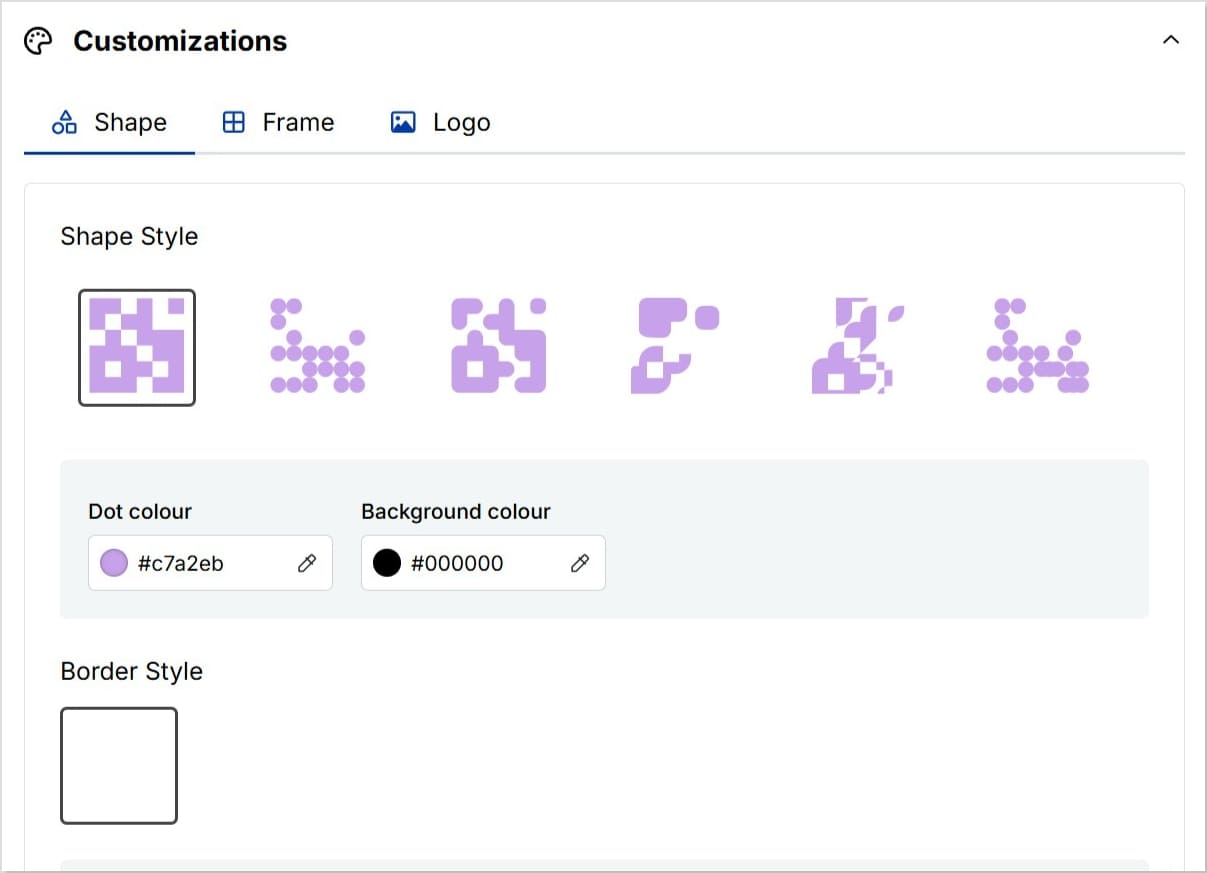
Can I customize the look of my Zoom QR code?
Absolutely. You can add your logo, change colors, and adjust the design to match your brand style.
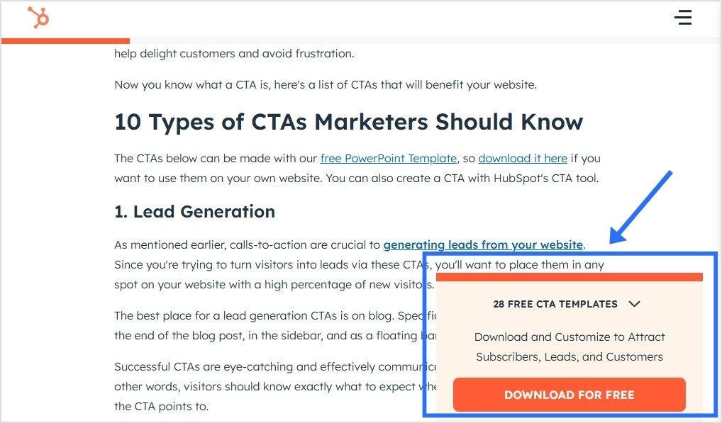
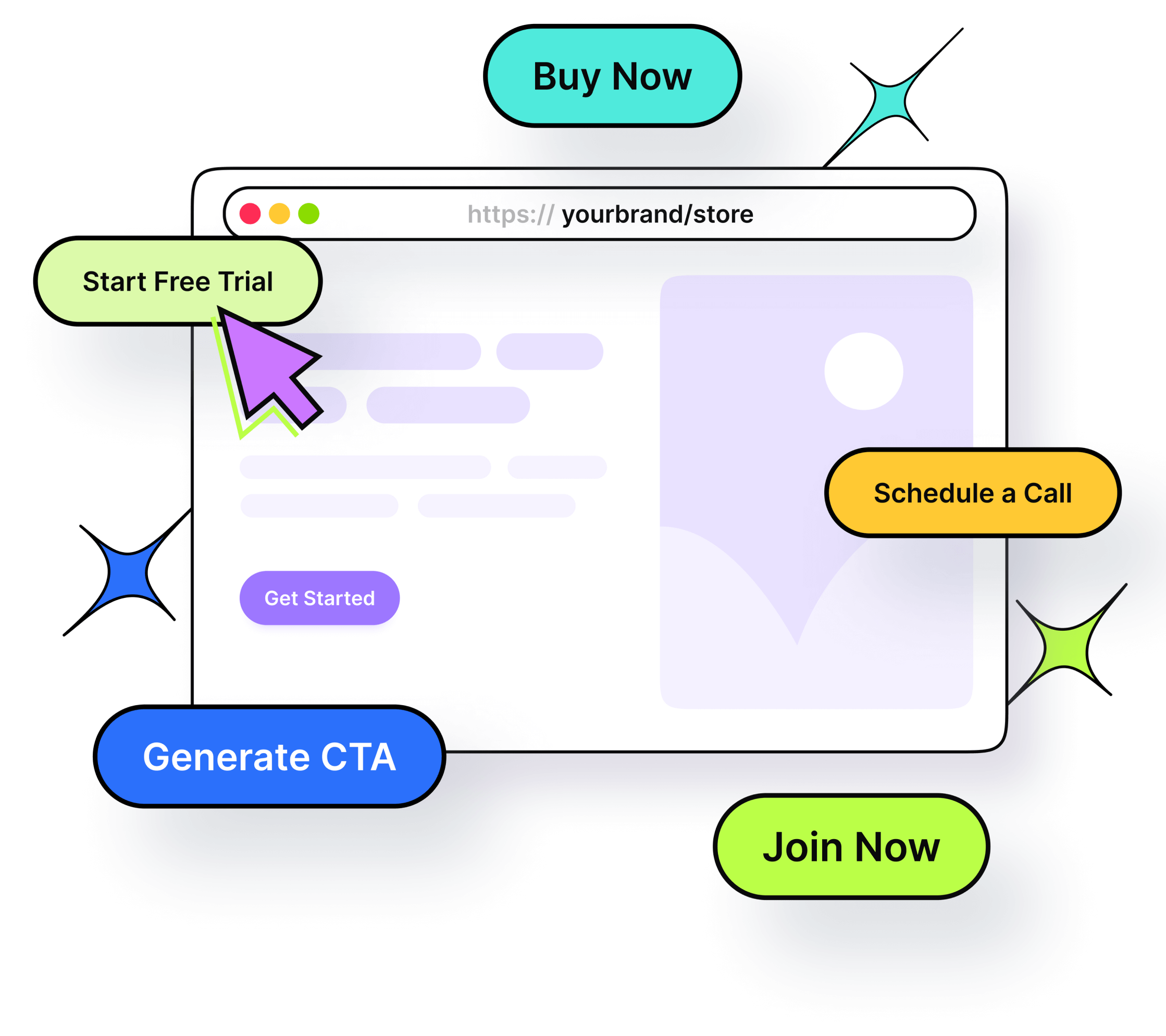
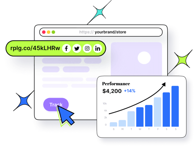
Sharing useful content is part of every marketer’s daily routine; whether it’s an insightful article, a trending video, or a how-to guide your audience will love, But what if, instead of stopping there, you could guide your audience toward the next step you want them to take; right on top of the content you share? That’s where call-to-action overlays come in.
Boost your conversion rates with irresistable CTAs with
In this blog, we’ll explore what CTA overlays are, how they work, why they’re powerful, real examples, templates, best practices, and how tools like Replug make creating call-to-action overlays simple, even if you don’t code.
What are call-to-action overlays?
A call-to-action overlay is a small, non-intrusive, and interactive pop up or banner (like a CTA banner or CTA button) that appears over content.
These overlays act as interactive prompts, encouraging users to:
Keep your brand visible even when sharing third-party content
For example, if you share an article about marketing trends, your CTA banner could invite readers to download your free eBook on the same topic.
With tools like Replug, you can add CTA overlays in minutes, turning every shared link into an opportunity to capture leads.
How do call-to-action overlays work?
You start by selecting a call-to-action generator like Replug; a tool that not only lets you add customizable call-to-action banners and pop-ups but also tracks clicks to see what’s working best.
Next, you:
Pick the content you want to share. It can be anything; an article, video, or guide that your audience will find useful and engaging.
Design your overlay. This could be a button, banner, or form featuring a short message and a clear call to action, like “Subscribe now” or “Get the free guide.”
Replug makes it easy to brand these overlays with your logo, colors, and style, so every shared link becomes a subtle marketing asset that drives traffic back to your website or landing page.
How to create call-to-action overlays with Replug
Adding CTA overlays with Replug is quick and doesn’t need any coding. Here’s how:
Step 2: Create a new CTA from the campaign section
Step 3: In the “Call-to-action” tab, select your button style (or call-to-action overlay).
Step 4: Click “Next”. Type in a catchy headline, message, button text, and link URL (or phone number) for your CTA campaign.
Step 5:Customize the look. Pick a colour palette or adjust it yourself by changing the background, text colour, and tweaking the appearance.
In just a few minutes, you’ll have a branded pop up, exit intent, banner, or social classic/modern CTA button ready to add to any shared link, helping you drive traffic to your landing page, collect leads, or promote special offers.
Boost your conversion rates with irresistable CTAs with
Keeping your brand visible, encouraging ongoing engagement, linking to social or special pages
With Replug, adding these CTA overlays to your shared links is simple. You can turn every pop up, banner, or social classic/modern CTA button into a powerful tool to guide visitors back to your landing page, newsletter, or offer.
Best practices for designing effective CTA overlays
Your call-to-action (CTA) overlay isn’t just a button or banner; it’s the make-or-break moment between a visitor and a conversion. A few thoughtful tweaks can turn a passive visitor into an active user.
Here’s how to get it right:
Keep it clear and actionable
Use verbs that make the next step obvious: “Download your free ebook now,” “Start free trial,” or “Get my exclusive discount.” Avoid vague CTAs like “Click here” or “Learn more,” as they don’t clearly communicate the benefit to the user.
Add your official contact information
Include your business email, phone number, or website so people know the overlay is legitimate and can easily reach you.
Make it stand out but stay on-brand
Your CTA overlay should catch the eye without clashing with your overall design. Use contrasting colors that draw attention, while still fitting within your brand palette. Rounded corners and subtle shadows can also make buttons feel more inviting and clickable.
A call-to-action overlay should be large enough to notice, but not so large it feels overwhelming. Place it above the fold and repeat it after key sections or at the end of longer pages, so visitors always have an opportunity to take action without scrolling back.
Test different variations
Small changes, like updating text from “Sign up” to “Join free,” or adjusting the button color, can affect conversion rates. Use A/B testing to see which combinations work best for your audience.
Create a sense of trust and urgency
Adding phrases like “Secure checkout,” “Limited offer,” or “Offer ends today” helps encourage faster action and reassures users about the safety of their information.
Keep it concise
CTA text should typically stay between two to five words. Short, direct messages have more impact and are easier for users to process quickly.
Tip: If you’re using tools like Replug to add CTA overlays to curated content, apply the same best practices: clear copy, contrasting design, and strategic placement. This will guide users toward your goal effectively.
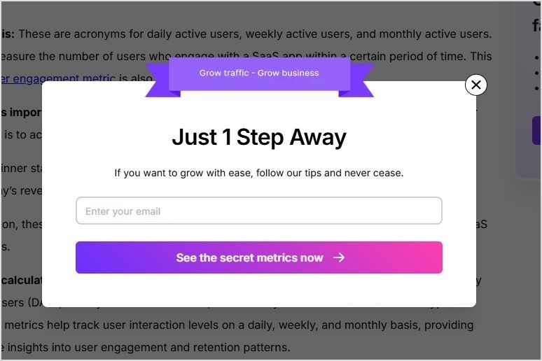
Examples of call-to-action overlays
Here are some examples of the different types of call-to-action overlays:
Need a little spark to write your overlays? Here are real-life inspired CTA overlay templates or CTA button templates you can copy, tweak, and make your own. From popups to banners and scroll boxes, these aren’t your typical “click here” buttons; they’re punchy, playful, and crafted to get real clicks.
Scenario
Overlay type
Template (headline + message + CTA button)
Sharing a trending industry article
Popup
Headline: “Get our free 2025 social media checklist!”Message: “Stay ahead of trends with proven tips.”CTA button: “Show me the secrets”
Sharing a product review blog
Banner
Headline: “Limited-time offer!”Message: “Use code SAVE10 for 10% off your first purchase.”CTA button: “Yes, I want the deal”
Sharing a whitepaper or report
Banner
Headline: “Need expert advice?”Message: “Book a free consultation to grow your business.”CTA button: “Let’s make a plan”
Sharing a YouTube video
Social modern
Button text: “Send me fresh tips”
Sharing a lifestyle blog
Exit intent
Headline: “Wait! Don’t miss this deal.”Message: “Sign up now and get 10% off your first order.”CTA button: “Unlock my discount”
Sharing a blog on productivity hacks
Scroll box
Headline: “Want to work smarter?”Message: “Book your free strategy call today.”CTA button: “Yes, boost my workflow”
Call-to-action overlays transform every piece of shared content into a conversion tool.
Whether you’re driving traffic to your landing page, collecting emails, or promoting offers, CTA overlays keep your brand in the spotlight, even on third-party content.
Tools like Replug make adding CTA banners, popups, and buttons effortless, helping you capture more leads without extra effort.
They’re small popups or banners that appear over content, prompting users to take action (e.g., click, subscribe, visit a landing page).
Why don’t CTA overlays work on every website?
Some websites like Facebook, LinkedIn, or most Google pages, use iframe restrictions to protect their content. This means they don’t allow their pages to be displayed inside another page. When this happens, tools like Replug offer an option to create a summary page. Instead of showing the original site directly, your audience sees a branded page summarizing the content, along with your CTA overlay.
Can I customize the design of my call-to-action overlay?
Yes! With tools like Replug, you can change text, colors, and CTA button styles to match your brand.
What is the best practice for CTA placement?
Place CTAs where they naturally fit into the user journey: above the fold, at the end of content, or triggered by user behavior (like scrolling or exit intent). With call-to-action overlays, you can place them to appear as popups, banners, or scroll boxes, so they stay visible without being disruptive.
Are call-to-action overlays compatible with all content?
In most cases, yes! Call to action overlays are compatible with blog posts, articles, YouTube videos, product pages, and landing pages. Some sites may block iframe-based overlays, but you can counter this by creating a bridge page using Replug.
What is an example of a call to action?
A simple example: “Subscribe to get our free weekly tips.”
As a call-to-action overlay, this might appear as a banner over an article you share, or as an exit intent popup inviting visitors to sign up, keeping your message front and center even when sharing external content.
Is a CTA always a button?
Not always! While CTAs often appear as buttons because they’re clear and clickable, they can also be banners, text links, floating widgets, or popups, especially when used as call-to-action overlays on shared content.
What’s the difference between a CTA banner and a popup?
A banner stays at the top or bottom of the page, while a popup appears in the center or corner, often for email capture.
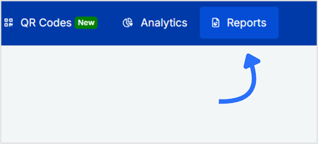
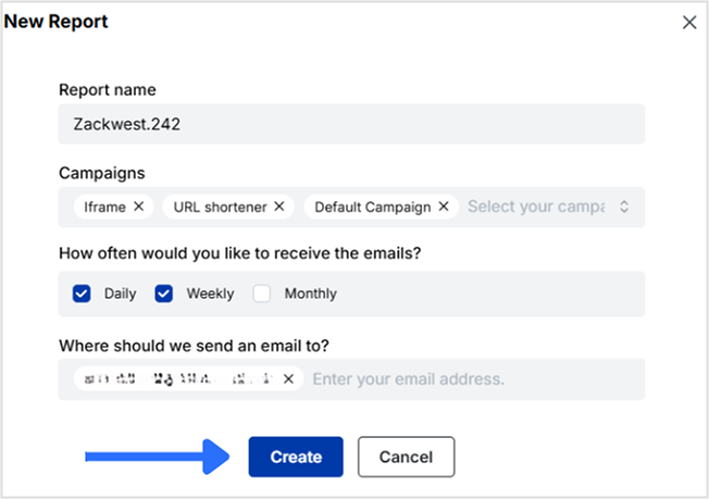
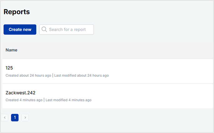
Reports are the backbone of any data-driven marketing strategy. Whether you’re tracking link clicks, QR code scans, or retargeting performance, having accurate, easy-to-understand reports is key to making informed decisions. That’s where Replug makes your job easier. It offers a built-in reporting feature that automatically tracks your campaign performance, no spreadsheets, no manual effort. From branded links and traffic routing to bio links and QR codes, you can monitor it all in one place. In this guide, we’ll walk you through how to create a Replug report from scratch, so you can automate your tracking, simplify your workflow, and stay ahead of the curve.
A complete link management solution
for marketing professionals & agencies.
Try Replug for free
Here’s what you can track in Replug
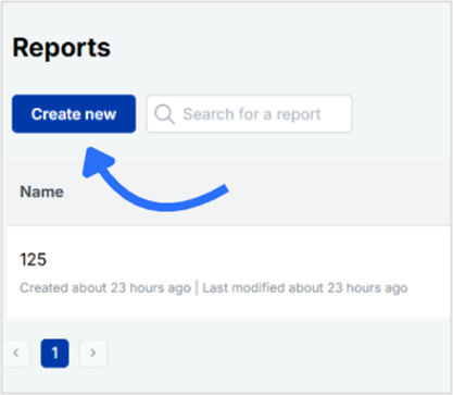
Above, you learned how to create a Replug report. Now you’ll explore what you can track with Replug. Replug offers powerful reporting tools that help you stay on top of your campaign performance without the hassle of manual tracking. Whether you’re a beginner or a seasoned marketer, Replug reports make it easy to monitor, analyze, and share results, all from one dashboard.
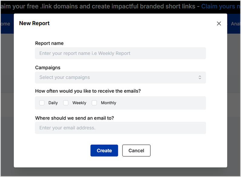
Automate and schedule reports directly to your inbox
Customize the look and feel of your reports with white-label options
Replug reports are designed to simplify your workflow, keep you informed, and help you make smarter, data-driven decisions.
Why use Replug reports?
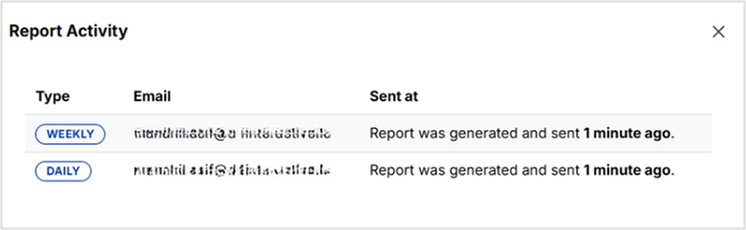
Replug reports simplify how you monitor performance across branded links, traffic routing campaigns, bio links, QR codes, and retargeting pixels. Instead of manually pulling data, you can schedule automated reports and get everything delivered straight to your inbox.
With just a few clicks, you can:
Analyze link clicks, traffic sources, and conversions
Track QR code scans by location, device, and browser
Share reports with clients, teams, or stakeholders
Creating a Replug report takes just minutes, but the insights it delivers can help you fine-tune your strategy, impress clients, and stay on top of performance, all without manual work. Also, with automation, branding options, and detailed analytics, Replug reports keep your campaigns smart and streamlined.
FAQ’s on How to create a Replug report
What data is included in a Replug report?
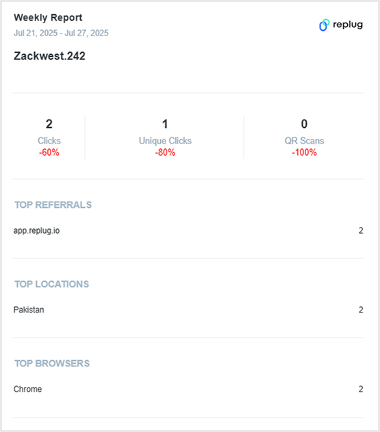
Replug reports include link clicks, unique clicks, QR code scans, referring sources, top browsers, top locations, and more, depending on the campaign type selected.
Can I send reports to clients automatically?
Yes. You can schedule reports to be sent directly to your client’s email on a daily, weekly, or monthly basis.
Can I customize the look of the report?
Yes, if you’re on pro or agency plan, you can remove Replug branding and add your branding.
Can I edit a report after creating it?
Absolutely. You can update campaign selections, change the email recipients, or adjust the schedule anytime.
Is there a limit to how many reports I can create?
There’s no fixed limit for most plans; however, higher-tier plans offer more flexibility.
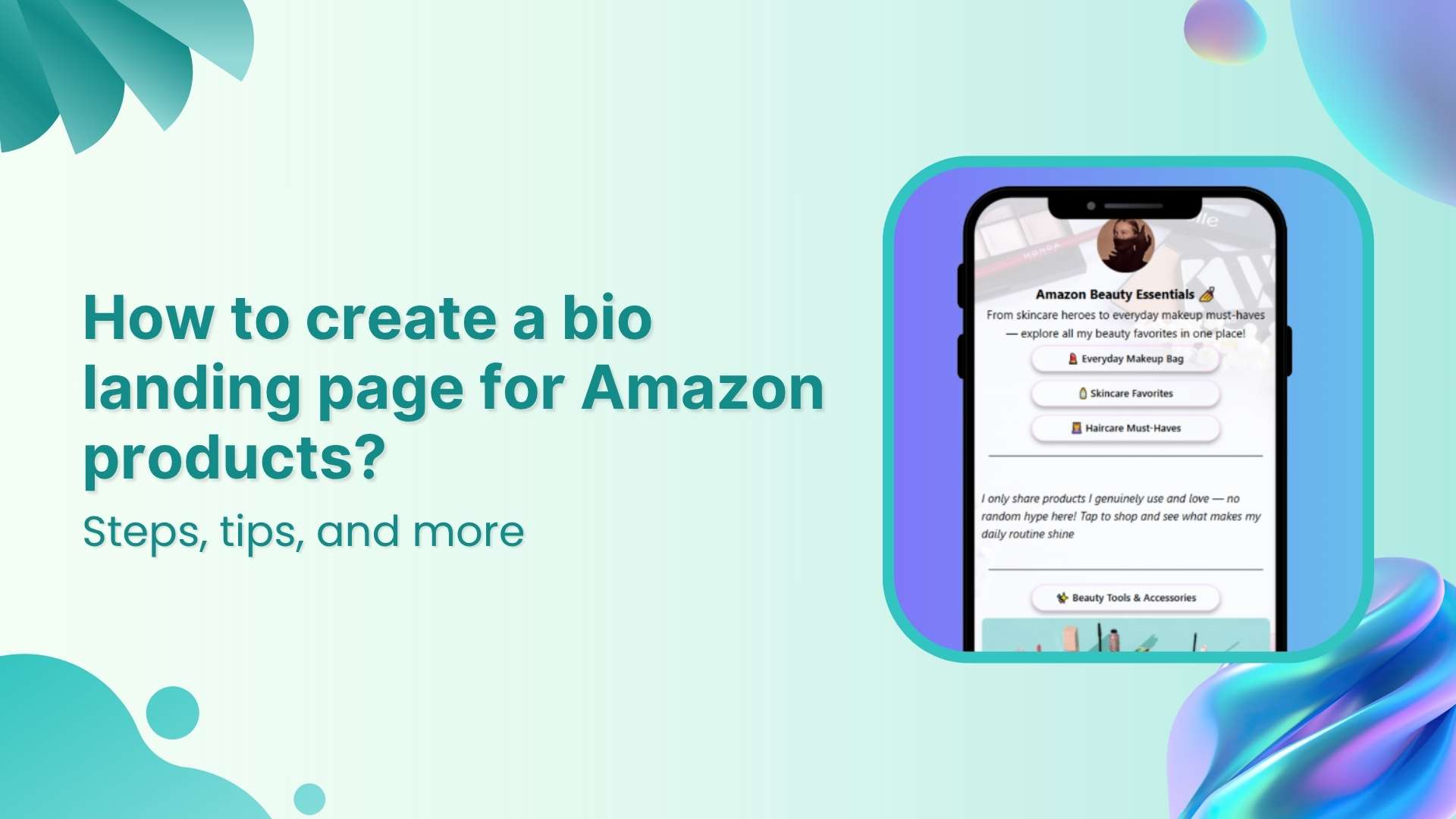
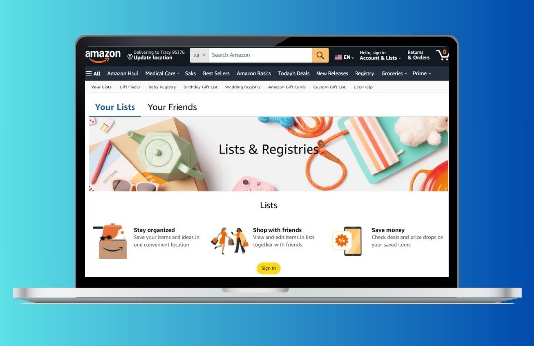
Selling products on Amazon sounds simple at first. But as your list grows with best selling products, affiliate offers, digital downloads, Kindle ebooks, and more, it can quickly feel overwhelming.
Most platforms only give you limited space to share these links. Updating them across bios, emails, and videos takes time, and your audience might miss your best offers.
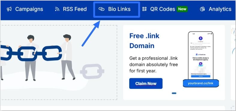
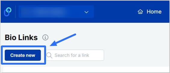
A landing page for Amazon products keeps everything in one place. With Replug, you can create a bio link page that holds all your links together. It’s easy to update anytime, so your followers always see your latest products and deals without extra effort.
In this guide, you’ll learn how to build that landing page step by step and keep your promotions fresh and organized.
Maximize marketing ROI
by transforming ordinary URLs into branded short links that convert.
Try Replug for free
Why create a bio landing page
When you’re sharing multiple offers, it doesn’t take long before you hit the limit:
Promoting best selling products on Amazon alongside your latest blog or video
Updating all those links separately can be time‑consuming, and your audience might miss something great.
If you also sell digital products on Amazon or run affiliate marketing campaigns, flexibility matters even more. Plus, since Amazon requires sellers to notify purchasers of hazardous products and issue refunds, you might need to update or remove product links quickly to protect your audience and your reputation.
A single landing page for Amazon products fixes this. You update your product list in one place, and your bio link stays the same.
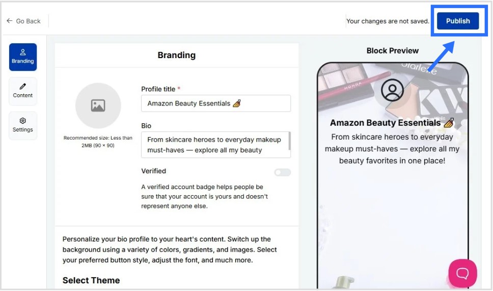
In the “Content” category, you’ll have the option to add your content blocks
Click on “Links” and paste links to your Amazon product pages, affiliate offers, or digital downloads
You can add more content block types if required; such as cards, socials, separator, etc
Keep updating as you go by clicking “Update” on the top right to save your progress
If you’re exploring how to make money on Amazon without selling physical products, affiliate marketing is your answer. You share Amazon links and earn a commission when someone buys.
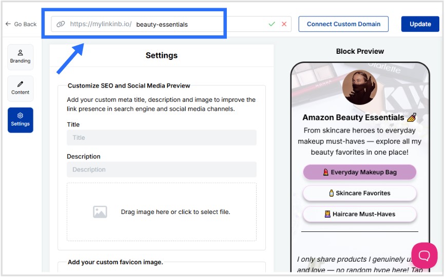
Step 4: Customize SEO and social media preview
Go to the “Settings” category
Add a custom meta title and description to improve how your landing page for Amazon products appears in search results
Upload a preview image that looks great when your page is shared on social media
Add retargeting pixels to track visitors and run targeted ads later (optional but highly recommended)
Step 5 (optional): Create a custom URL for your bio link
Personalize your landing page link to match your brand or product name
Create a custom URL by changing the slug of your bio landing page
This is how your final bio landing for Amazon products looks like:
Step 6: Share your landing page everywhere
Once your landing page for Amazon products is ready, share it across every channel where your audience hangs out. Add it to your Instagram and TikTok bio, YouTube description, Pinterest profile, email signature, blog sidebar, and even on printed materials with a QR code.
The more places you share your link, the more clicks and sales you can drive from people who discover you on different platforms.
Tips for your bio landing page for Amazon products
Creating a landing page is just one part of learning how to sell on Amazon effectively. To get even better results, try these extra tips that can help you drive more clicks and keep your page fresh:
Place your best selling products on Amazon at the top so they get more attention
Use direct titles like “Shop My Top Picks” instead of generic labels
Add UTM parameters to track which platform sends the most visitors
Highlight promotions and discounts on your Amazon products to catch attention
Add retargeting pixels so you can reach visitors again with targeted ads
Create a catchy call-to-action to encourage visitors to click and shop your Amazon products For example, try something like “See what I’m loving this month” or “Shop my current Amazon must-haves”
Keep your product list updated, especially if there are recalls or notice of hazardous products and issue refunds
A landing page for Amazon products isn’t just about adding more links, it’s about making your bio work smarter. Instead of juggling updates across multiple platforms, you control everything from one branded page.
Whether you’re promoting best selling products on Amazon, sharing digital downloads, or exploring how to make money on Amazon without selling physical items, this approach keeps your content organized and your audience engaged.
With tools like Replug, it’s simple to build, track, and update your landing page whenever you need, so your bio always stays up to date and your visitors always find your best offers.
FAQs on bio landing page for Amazon products
What is a landing page on Amazon?
A landing page on Amazon typically refers to a dedicated page that showcases a collection of your products or offers. In this guide, we’re talking about creating a landing page for Amazon products outside Amazon itself, like in Replug, so you can share multiple product links, affiliate offers, and digital content all in one branded link.
How to make an Amazon product page?
On Amazon, you create a product page by listing your product through Seller Central. You’ll add product details, images, pricing, and shipping information. If you want to promote several products together, a separate landing page (like the one you build in Replug) can help organize and share those links easily.
How to get traffic to your Amazon product?
Promote your landing page for Amazon products across social media, emails, blogs, and videos. Use engaging calls to action, share limited-time deals, and add UTM parameters to track which channels bring in the most clicks.
How to make up to $10,000 per month on Amazon without selling physical products?
Many affiliates are able to do this by joining the Amazon Associate Program. By sharing affiliate links to best selling products on Amazon, ebooks from Amazon’s Kindle Direct Publishing platform, or other digital content on your landing page, you can earn commissions on purchases without holding inventory.
Can I sell products directly through my landing page?
No. The landing page itself doesn’t process transactions. Instead, it links visitors to your product pages on Amazon, digital downloads, or affiliate offers where they complete their purchase.
What if an Amazon link breaks or a product is removed?
That’s one of the advantages of using Replug. You only need to update the broken or outdated link on your landing page, and it automatically updates everywhere you’ve shared your bio link.
In the beginning, QR code generators were mostly used for testing or simple features in games where the destination didn’t really matter. But today, a reliable random QR code generator is an asset for developers, marketers, agencies, and everyday users alike.
What is a random QR code?
A random QR code is a dynamic QR code that leads users to a different destination each time it’s scanned by rotating between multiple URLs.
Whether you’re testing QR code functionality, running A/B marketing experiments, or creating quick, scannable links for your projects, QR codes have the speed and flexibility to get it done effortlessly.
QR code usage has exploded in recent years. In 2025 alone, global scans reached 41.77 million, marking a 433% increase over the past four years. With this rapid growth, more businesses and creators are turning to smart tools like Replug to automate QR code generation.
Replug allows you to create branded short links, rotate multiple URLs, and generate trackable, customizable QR codes, all from one platform.
Maximize marketing ROI
by transforming ordinary URLs into branded short links that convert.
Try Replug for free
Step 1: Sign in to your Replug dashboard
Sign in to the Replug app. If you don’t have an account, sign up to get access to a 14-day free trial with full features.
Step 2: Create a short link campaign
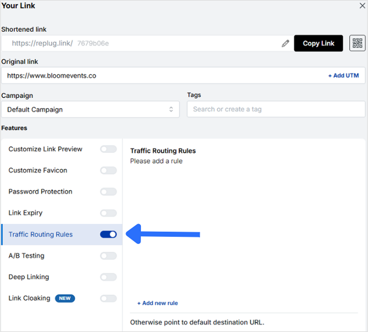
Once you’re on the main dashboard, paste your base URL into the “Quickly shorten your link” bar and hit Enter. Then, click on the “Traffic Routing” option to start setting up your rotating destinations.
Click on “+ Add New Rule” to open a new window.
Step 3: Use Replug’s traffic routing feature
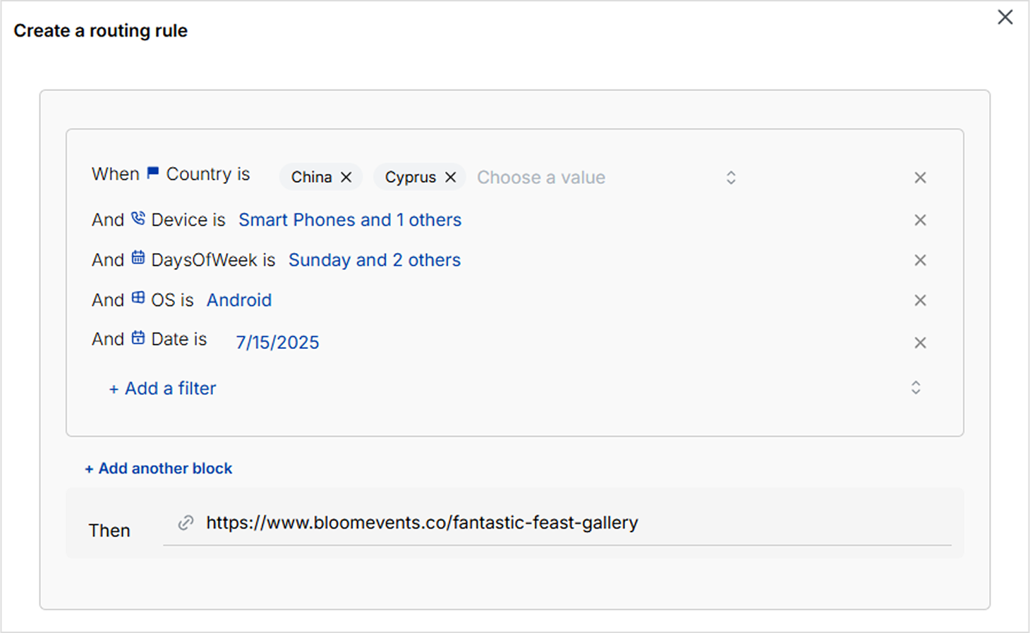
Here, you can define custom destination URLs based on filters like country, date range, device type, operating system, and more.
Replug allows you to add up to seven different destinations for a single short link.
Since it’s a dynamic QR code generator, you can update or change these destinations anytime, even after the QR code has been created.
Step 4: Generate a QR code for the short link
Once you’ve set up your random rotation link, head to the “QR code” tab in Replug. Click the small QR code icon next to your short link to generate your code.
They’re perfect for gamified experiences like “scan to win,” hidden discounts, or rotating messages.
They reduce costs and streamline workflows, especially for agencies managing multiple campaigns.
Tools like Replug offer detailed analytics, allowing you to track scans, devices, and user behavior in real time.
They work well in print media, one QR code on a flyer or package can serve fresh content over time.
They enhance the overall user experience by making interactions more dynamic, interactive, and memorable.
Final thoughts
Random QR codes have come a long way from basic functionality to becoming powerful tools for testing, marketing, and user engagement. With platforms like Replug, creating and managing these codes is not only simple but highly customizable and data-driven. Whether you’re looking to rotate links, run A/B tests, or craft interactive experiences, random QR codes offer the flexibility you need. And with Replug, you can do it all from one smart dashboard.
FAQs on random QR code
1. What is a random QR code?
A random QR code is a dynamic code that redirects users to different destinations with each scan. It can rotate between multiple URLs or display randomized content like discount codes, messages, or landing pages.
2. Can I control which links the QR code rotates between?
Yes. Replug’s traffic routing feature lets you manually set up to seven different destinations. Which can be shown based on rules like country, device type, etc.
3. Can I update the destination URLs after generating the QR code?
Absolutely. Since Replug generates dynamic QR codes, you can change, edit, or add new destinations anytime, without needing to reprint or redistribute the QR code.
4. Is the QR code trackable?
Yes. Every QR code generated in Replug is connected to a trackable short link. You can monitor scans, devices, locations, and other analytics from your dashboard in real time.
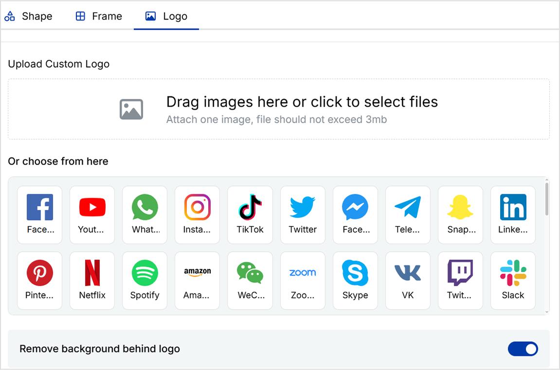
5. Can I add my brand’s logo or customize the QR design?
Definitely. Replug lets you fully customize your QR code’s style, color, frame, and logo. So it matches your branding and looks professional wherever it’s displayed.
6. Do I need a paid plan to use the traffic routing and QR code features?
Replug offers a 14-day free trial with full access to all features, including traffic routing and QR code customization. After the trial, these features are available on paid plans.
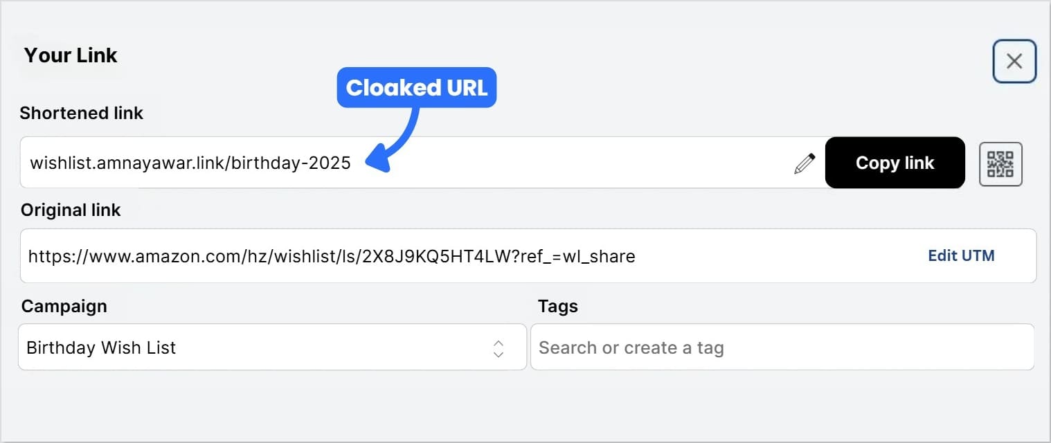
Amazon Wish Lists feel like mini mood boards for life’s special moments; from baby showers, to birthdays and weddings. Creating this Wish List is often the fun part; picking out things you love, imagining them in your life, and sharing that excitement with the people who care. But, sharing a messy Amazon Wish List URL into every invite or group chat? Not exactly pretty.
So, instead of sending long, clunky URLs, why not create a beautiful, scannable QR code your friends and family can use instantly? In this guide, you’ll discover how to make a QR code for Amazon Wish List with Replug so you can share your list easily, track its analytics, and keep it updated anytime. Let’s begin!
Maximize marketing ROI
by transforming ordinary URLs into branded short links that convert.
Try Replug for free
Why create an Amazon Wish List QR code
A Wish List isn’t just a list of things; it’s part of the excitement around big moments and small celebrations.
Creating a gift registry QR code means your guests, friends, or followers don’t have to copy-paste long URLs. Instead, they can scan and instantly see your Wish List from anywhere: wedding placards, baby shower invites, thank-you cards, or even an Instagram story. It’s the easiest way to make your Wish List feel modern, thoughtful, and completely your own.
With Replug, your QR code can be:
Dynamic, so you can change the destination URL of your Amazon Wish List anytime without needing to recreate or resend your QR code.
Branded, with your colors, logo, and style.
Trackable, so you know how many times it’s been scanned and from where.
Now, let’s move on to how you can make an Amazon Wish List QR code using Replug.
How to make a QR code for Amazon Wish List with Replug
Step 1: Find and copy your Amazon Wish List URL
First, you’ll need your Wish List link:
Log into Amazon and click ‘Accounts and Lists’ on the top right.
Pick ‘Wish List’ or ‘Your Lists’ to see what you’ve already created.
Choose permissions: View only (great for sharing) or Edit (if you want others to add items).
When you’re ready to share, simply click the “Invite” button at the top of your list. From there, you can copy the link directly or send it using the “Email” or “Text Message” options.
Tip: For smooth sharing, set your list to Public or Shared. Go to the three dots > Manage List to check this.
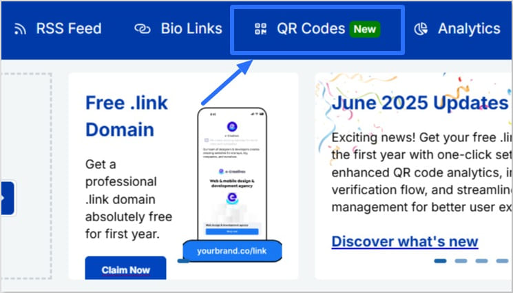
Step 2: Generate your Amazon Wish List QR code in Replug
Now for the fun part!
Sign in to the Replug app. If you don’t have an account, Sign up to get access to a 14-day free trial with full features
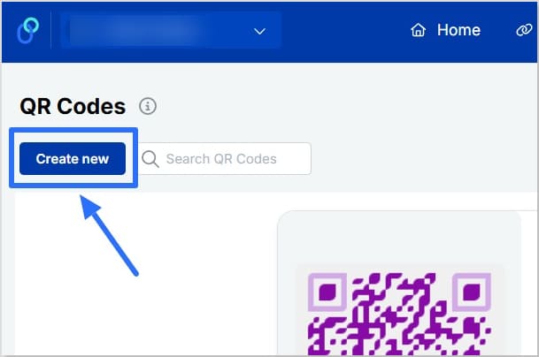
Click “QR Codes” on the left, then hit “Create new”
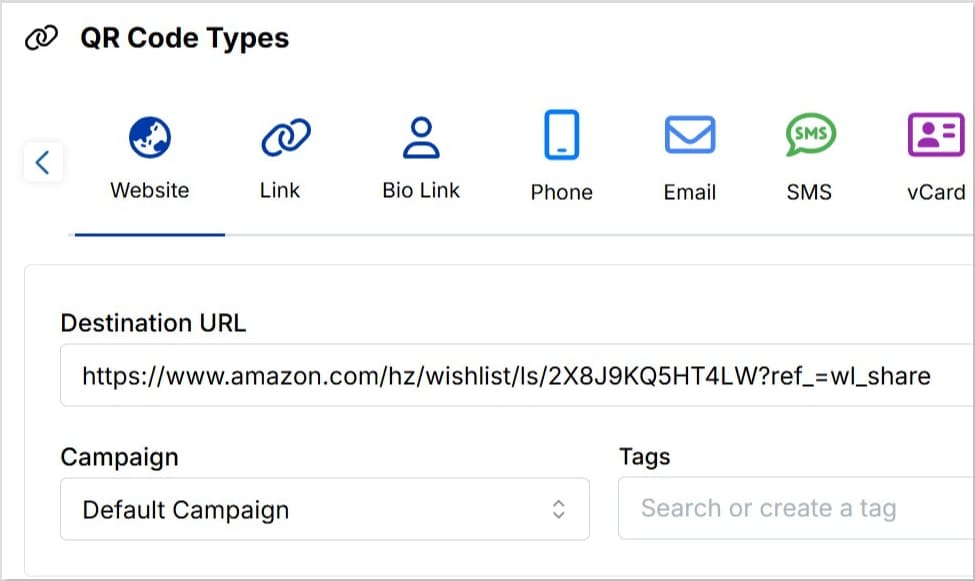
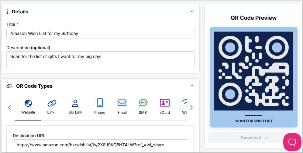
Add a title and description (optional) for your Amazon Wish List QR code
Choose “Website” as your QR code type and paste in your copied Amazon Wish List URL in the “Destination URL” bar
Connect it to a campaign if you want (optional)
In seconds, you’ve got the start of a Wish List QR code you can make uniquely yours.
Creative ways to share your Amazon Wish List QR code
Your QR code isn’t limited to invitations or cards. You can share it almost anywhere people already connect with you:
Print it on wedding invitations, baby shower cards, or birthday party stationery
Add it to thank-you cards, menus, seating charts, or event signage so guests can scan it right at the venue
Share it on Instagram stories, TikTok videos, or include it in your bio links so your Wish List is always one tap away
Include it in email newsletters, holiday e-cards, or digital announcements
Place it on packaging inserts if you sell products online. It can double as a gift registry or curated list
Try adding seasonal or event-specific Wish Lists with unique QR codes to keep things fresh
Tip: Adding a short caption like “Scan to view our Wish List” makes it clear what the code leads to, especially for guests who might not be used to scanning QR codes.
These small steps help your Wish List QR code feel personal, reliable, and easy for anyone to use, whether it be online or in print.
To wrap it up…
Your Amazon Wish List is about bringing people together to celebrate life’s moments, big and small. With Replug, you can easily learn how to make a QR code for Amazon Wish List, personalize it, keep it updated anytime, and see how people interact with it.
It’s a small step that makes sharing feel thoughtful, modern, and effortless.
FAQs for how to make a QR code for Amazon Wish List
Can I create a QR code for an Amazon Wish List?
Yes. Using a QR code generator like Replug, you can easily create a scannable code for your Amazon Wish List. Just copy your Wish List URL, paste it into the generator, and customize the design to match your style or event.
Can I track who scans my QR code?
You can’t see individual names, but with tools like Replug you can track total scans, unique scans, clicks, locations, devices, and referral sources. This helps you see which channels (like Instagram, email, or printed cards) bring the most engagement.
What if I add new items to my Wish list later?
As long as you keep the same Amazon Wish List URL, your QR code will still work. And if you create a new Wish List with a different URL, you can simply update the destination link if you’re using a dynamic QR code in Replug.
Where should I share my Wish list QR code?
You can print it on wedding or baby shower invitations, thank-you cards, event signage, menus, and packaging inserts. You can also share it digitally in Instagram stories, TikTok videos, bio links, email newsletters, or even as part of seasonal campaigns.
How do I create a link for my Amazon Wish List?
Go to Amazon, click “Accounts and Lists,” choose your Wish List, then select “Send List to Others.” Choose your sharing permissions, click “Copy Link,” and you’ll get a shareable Amazon Wish List URL.
How to find a Wish List on Amazon?
In Amazon’s menu, go to “Accounts and Lists,” then click “Your Lists” to see your own lists. To find someone else’s Wish List, go to “Find a List or Registry” and search by name or email if their list is set to public.
How to find someone else’s List?
In the “My Lists” section, you’ll find an option labeled “Find a List or Registry.” Just enter the person’s name to search. Or, you can ask your friends and family to share their list directly with you.
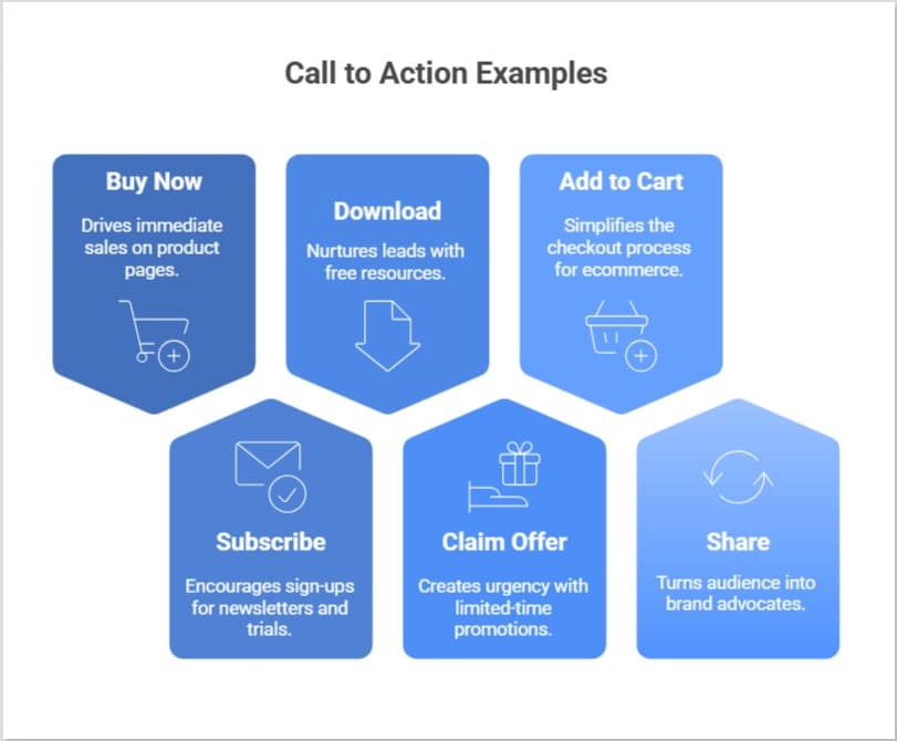
Every marketing message needs a final spark; a clear, direct step that turns a passive visitor into an active customer. This is where the CTA, or call to action, plays its part. By guiding your audience from curiosity to action, it helps increase engagement and turns interest into measurable results.
But what is a CTA in marketing, and why does it matter so much?
In this blog, we’ll look at what CTA stands for in marketing, explain the difference between soft CTA and hard CTA, look at powerful CTA examples in marketing, explore practical tips, and how tools like Replug help you create a CTA that increases your conversion rate.
Boost your conversion rates with irresistable CTAs with
CTA stands for call to action. In marketing, it’s what tells your audience what to do next, like “buy now”, “subscribe”, or “download”.
The call to action marketing definition is simple: it’s about guiding your audience from just looking to actually doing. CTAs appear as buttons, hyperlinks, banners, or even phrases in videos and emails. They might be as direct as “start free trial” or as gentle as “discover more”, but their purpose stays the same: lead people toward action.
CTA in marketing: why it matters
What does CTA mean in marketing? It means turning curiosity into clicks, and clicks into measurable business results.
Think of your content as a conversation. Without a CTA, that conversation stops short; you’ve sparked interest, but you haven’t shown what to do next. Effective CTA marketing bridges that gap. It keeps visitors engaged, increases your ROI, and helps you guide each person through the customer journey, from awareness to consideration and finally to decision.
In other words, CTA in marketing isn’t just about adding a button; it’s about creating a clear path your audience wants to follow.
Types of CTAs: soft CTA vs. hard CTA
Successful marketing often uses a mix of soft CTA and hard CTA, matched to where your audience is in the funnel.
Type
What it does
Examples
When to use
Soft CTA
Encourages low‑commitment, exploratory steps
– Learn more – See how it works – Discover more
Early stages: Building trust and educating
Hard CTA
Pushes for a final, decisive action
– Buy now – Subscribe – Download now
Later stages: When your audience is ready to convert
Using both keeps your CTA marketing natural: soft CTAs spark interest; hard CTAs convert that interest into results.
How to create an effective call to action for marketing?
There are many tools out there to help you craft a compelling call to action as part of your marketing strategy. However, Replug stands out because it offers a custom overlay creator designed to simplify the entire process.
Inside Replug, you can create a dedicated CTA campaign, choosing your message, button text (buy now, subscribe, or any custom copy), and styling it to match your brand’s look and feel. You can also create dynamic CTAs that adapt based on your audience or campaign goals, helping you keep messaging fresh and personalized without starting from scratch.
Moreover, you can decide where your CTA appears: as a pop‑up, using a banner template, or even on a bridge page when direct overlays aren’t supported on platforms like Facebook or Google.
Boost your conversion rates with irresistable CTAs with
Crafting CTAs isn’t only about writing clever text; it’s about understanding what will truly motivate your audience to act.
Start by knowing your goal
Before writing your CTA, decide what you want to achieve. Are you trying to get sign‑ups, drive direct purchases, or increase downloads? A clear goal ensures your CTA aligns with your content and your business strategy.
Use action‑oriented language
Strong verbs like “start”, “discover’, “join”, “buy now”, or “subscribe” add energy and clarity. They don’t just tell users what to do; they help them feel ready to do it.
Focus on benefits, not just actions
People click when they see what’s in it for them. Instead of “submit”, try “get your free guide”. This approach shifts attention to the value your offer provides.
Design for visibility
A CTA button should catch the eye without overwhelming the design. Contrast with surrounding colors, add whitespace, and keep fonts bold yet clean.
Strategic placement matters
CTAs don’t always belong only at the bottom. Try placing them after product descriptions, in blog posts, or as exit pop‑ups. Replug even lets you add branded CTAs on curated content you share, so every link becomes part of your funnel.
Note on platform restrictions Some digital platforms like Facebook, Google, or YouTube restrict adding custom CTAs directly due to iframe or embed policies; which can be frustrating for users, especially affiliates. To work around this, you can use Replug to create a bridge page: a branded intermediate page that appears before the final destination. It hosts your CTA, so you still guide users to act, even when the original site doesn’t allow it.
Users often skim online. A short, direct CTA like “shop the collection” or “download” now usually outperforms longer, complex phrases.
Use CTAs in bio links and captions
Add CTAs to Instagram bios, TikTok profiles, and captions to drive clicks. With tools like Replug, you can turn one bio link into a branded landing page with multiple CTAs. Perfect for affiliates and creators who want to track every click.
Phrases like today, “limited‑time offer”, or “don’t miss out” gently nudge users to act sooner rather than later.
Test, learn, repeat
Use analytics and A/B testing to see which CTA marketing ideas resonate most. Even a single word change can move your conversion rate.
Great CTA marketing is an ongoing process: set clear goals, test, learn, and refine.
Benefits of using the right CTA
A well‑planned CTA strategy does more than increase clicks. It transforms how your audience experiences your brand:
Guide visitors to act with confidence: Clear, well‑placed prompts remove hesitation. When visitors know exactly what to do next, they’re more likely to take action; whether that’s buy now, subscribe, or download.
Focus on real value, not just clicks: Effective CTAs highlight what matters most to your audience: exclusive access, discounts, or helpful content, turning curiosity into meaningful engagement.
Track performance and refine your strategy: With tools like Replug, every click can be tracked. This means you see which CTAs get real results, run A/B tests, and keep improving your conversion rate over time.
Add CTAs even where platforms restrict them: Some platforms (like Facebook, Google, or YouTube) limit direct CTAs because of iframe or embed restrictions. Replug solves this by letting you create customizable bridge pages.
Build brand trust through consistency When your CTAs match your design and tone everywhere, from emails to shared links visitors feel a seamless brand experience. This consistency builds confidence and makes users more comfortable saying yes.
Boost ROI with branded URLs!
Enhance your marketing campaigns by creating shareable, trackable, and fully multi-purpose
customizable branded URLs.
When using a CTA in digital marketing, what works best isn’t always obvious. That’s why A/B testing (also called split testing) is essential: it helps you compare two or more versions of a call to action to see which performs better and drives more conversions.
Split testing allows you to test different elements like copy, color, size, placement, or design, to identify the most effective combination for engagement and conversions.
For example, you might test:
Buy now vs. Get yours today
Button color or size
Placement at the top, middle, or end
Bold button vs. simple text link
By systematically running these experiments and analyzing the data, you make data‑driven decisions instead of relying on guesswork. Over time, you can refine your CTAs by iterating on successful variations and discarding the ones that don’t perform.
Tools like Replug make this process easier: you can quickly create multiple CTA versions, track clicks, and see what resonates best with your audience. That way, your CTA marketing strategy keeps improving, backed by real insights rather than assumptions.
Start crafting CTAs your audience wants to click
Using a CTA in your marketing campaigns isn’t just about telling people what to do. It’s about creating a moment that moves them from interest to action.
Using right wording, placement, and tools like Replug, you can craft CTAs that feel authentic and turn passive visitors into loyal customers.
FAQs about CTA marketing
What does CTA stand for in online marketing?
CTA stands for Call to Action. It’s any prompt that directs your audience toward a desired action, like buying a product or signing up for updates.
What is an example of a CTA?
A CTA (call to action) can be as simple as “Buy now,” “Subscribe,” “Learn more,” or “Download your free guide.” It’s any prompt that encourages the audience to take a specific next step.
What are the disadvantages of a CTA?
If used poorly, CTAs can feel pushy, repetitive, or off‑brand. Overusing them may overwhelm visitors, while unclear or generic CTAs can confuse rather than guide, leading to lower conversion rates.
What is a CTA button in marketing?
A CTA button is a clickable element designed to stand out and prompt users to act. For example, adding an item to a cart, subscribing to a newsletter, or starting a free trial.
Is there a tool to create and test CTAs easily?
Yes. You can use tools like Replug to design, customize, and test CTAs across your marketing campaigns. It lets you create CTA campaigns, run A/B tests, track performance, and even add CTAs to shared links, including bridge pages when direct overlays aren’t supported on platforms like Facebook or Google. This makes it easier to refine what works and keep your branding consistent.
How do CTAs impact SEO?
While CTAs themselves don’t directly change your search ranking, they guide users to engage more deeply with your site. This can reduce bounce rates, increase time on page, and send positive user signals to search engines.
What does CTA mean on Instagram?
On Instagram, a CTA could be text in a caption like “Tap the link in bio,” stickers in Stories such as “Swipe up,” or buttons like “Shop Now” that encourage immediate engagement.


![Call-to-action overlays: Types, tips & templates [+ examples]](https://staging-blog.replug.io/wp-content/uploads/2025/07/What-is-a-call-to-action-overlay-1.jpg)