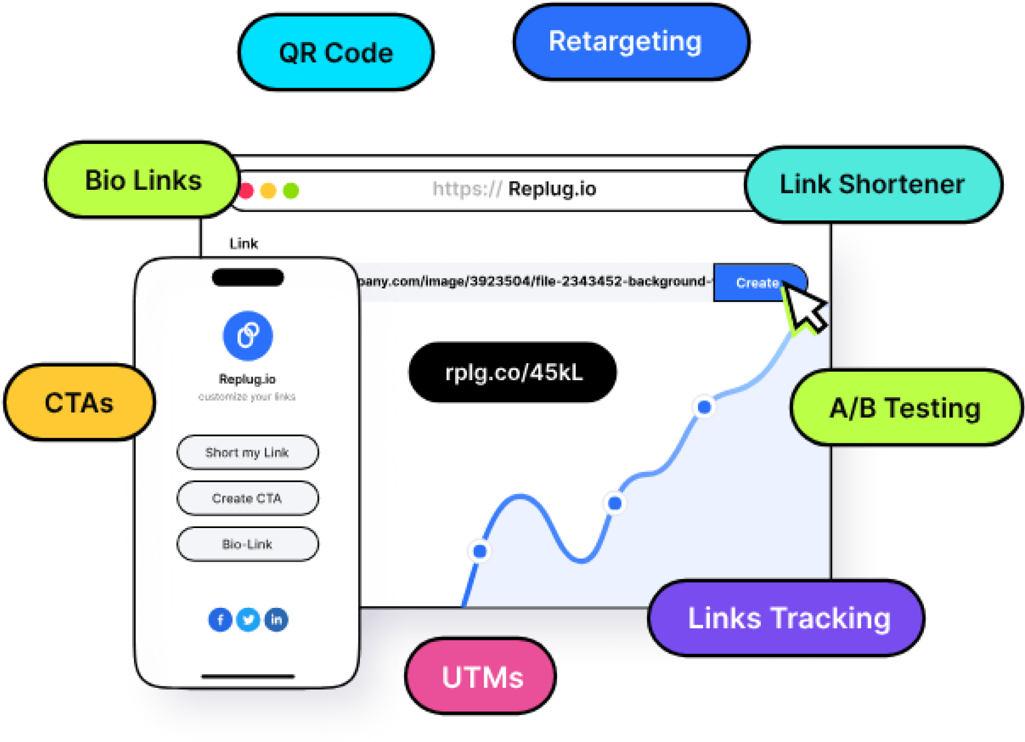
Driving traffic to your content is essential for success in the digital age. Whether you’re sharing content on social media, in emails, or through advertisements, your click-through rate (CTR) is a critical metric that directly impacts your online presence.
While there’s plenty of advice on improving CTR through content optimization, one often overlooked factor is the link itself. In fact, one of the most effective yet underused strategies to increase CTR using branded links is by turning generic, forgettable URLs into clear, trustworthy ones that reflect your brand identity.
In this article, we’ll explore how branded links can significantly enhance your CTR and why they deserve a place in your marketing toolkit.
Maximize marketing ROI
by transforming ordinary URLs into branded short links that convert.
Try Replug for free
Understanding CTR
Before diving into the world of branded links, let’s establish a clear understanding of CTR. Click-through rate (CTR) is a vital metric in online marketing, expressed as a percentage. It’s the number of times a link is clicked divided by the number of times it’s viewed. Simply put, if your link gets ten views and one click, your CTR is 10%. Now, let’s delve into why CTR is so crucial.
Let’s say you crafted a groundbreaking piece of content that has the potential to change lives, but no one reads it. Bummer, isn’t it?
The quality of your content will only matter if it reaches your target audience. And the first step? Getting them to click.
Your link is the bridge between you and your reader, making CTR a make-or-break factor for your content’s success.
What are branded links?
Branded links, also known as vanity URLs or custom short links, are URLs that have been customized to include a specific brand’s name or a relevant keyword. Unlike generic, lengthy, or complex URLs, branded links are shorter, more descriptive, and often feature the brand’s domain name or a recognizable keyword, making them more user-friendly and visually appealing.
Now that we have a grip on the concept of CTR and branded links, let’s discuss how the way you use them can make or break your results. A well-crafted branded link can boost trust, clicks, and conversions; while a poorly executed one can do the opposite.
In the next section, we’ll dive into the best ways to increase CTR using branded links, so you can use them to their full potential.
7 best ways to increase CTR using branded links
Let’s explore how you can leverage branded links to optimize your CTR.
Include your brand name in the link:
The domain is the first element of your link, and it’s imperative to include your brand name. Many people use link-shortening tools for brevity, but this often obscures the brand name. Branded links, also known as vanity URLs, remedy this by showcasing your brand, increasing trust, and building brand awareness.
Use a unique top-level domain (TLD):
After your domain, the choice of Top-Level Domain (TLD) can impact CTR. New TLDs can help your link stand out and convey relevance. For instance, using “.tech” for tech-related content or “.store” for online retail adds clarity and can attract more clicks.
Include a keyword:
The URL slug, the part that comes after the slash, is an essential component of SEO. Branded links allow you to choose your keywords, ensuring your link’s relevance and SEO-friendliness. This customization can set you apart from generic shorteners that offer limited options.
Consider link length:
Long URLs can hinder readability and may be truncated on social media. Short, concise links are more appealing to users. Keep it simple to maintain interest and encourage clicks.
Use “https://” for secure links:
‘Https://’ before a URL signifies a secure connection with SSL certification, which builds trust in your brand’s links. Additionally, Google favors ‘https://’ sites in its search rankings, giving you an SEO boost.
Not sure how HTTPS differs from HTTP? Here’s a helpful guide that explains the difference between the two.
Make sure you keep your word:
Your branded link should match the content it leads to. Consistency builds trust, and trust drives clicks. The best way to do this is by adding a custom link preview when sharing links on social media channels with proper metadata (title, description, thumbnail).
Make them memorable:
Branded links are easier to remember, and that makes them more shareable across channels, even offline. When your audience can recall your links, they’re more likely to revisit and click. Keep tracking performance and optimizing your branded URLs regularly to boost results over time.
Maximize your CTR with Replug’s branded link solution
At Replug, we understand the importance of CTR in driving the success of your marketing campaigns. That’s why we’ve developed a comprehensive Branded link solution that takes your CTR optimization to the next level.
Our platform combines the power of branded links with advanced features designed to supercharge your CTR:
Branding and trust: Replug’s branded links prominently display your brand name, building trust and credibility with your audience.
Customization: Tailor your branded links to fit your brand’s style and messaging, ensuring every link you share is aligned with your marketing goals.
Tracking and analytics: Gain real-time insights into link performance and user engagement, allowing you to make data-driven decisions for maximum CTR.
A/B testing: Don’t just set and forget. A/B test different slugs or CTAs in your branded links. Even small tweaks can lead to noticeable CTR improvements.
Custom QR Codes: QR codes make your branded links scannable on physical materials like posters, packaging, or brochures. Replugs help bridge offline and online traffic through custom QR codes to boost engagement.
SMS links: Pair SMS marketing with branded links to increase trust and open rate. Clean, recognizable URLs in messages look more credible and drive higher CTR from your audience’s inbox.
Simplicity and memorability: Our user-friendly platform ensures that your links are not only effective but also easy to remember and share.
Maximize marketing ROI
by transforming ordinary URLs into branded short links that convert.
Try Replug for free
End note
Optimizing your CTR is crucial for the success of your online content. By understanding the importance of CTR and utilizing branded links, you can significantly increase the chances of your audience engaging with your content. These seven strategies are simple to implement and can yield substantial benefits.
Start using branded links today and watch your CTR soar, bringing your content to a wider audience and achieving the impact it deserves.
Maximize marketing ROI
by transforming ordinary URLs into branded short links that convert.
Try Replug for free
FAQs About branded links and CTR
What is a good CTR (Click-Through Rate)?
A “good” CTR can vary depending on the industry and platform, but generally, a CTR between 2% to 5% is considered average across most channels.
Are branded links better for SEO?
Yes. Branded links often include keywords and relevant slugs, making them more descriptive and SEO-friendly. Plus, when paired with https://, they signal trust and security to both users and search engines.
Can I use branded links outside of social media?
Absolutely! Branded links can be used in emails, SMS campaigns, printed materials, presentations, QR codes, and even podcasts. They’re memorable and easy to type, making them versatile for both online and offline channels.
What tools can I use to create and track branded links?
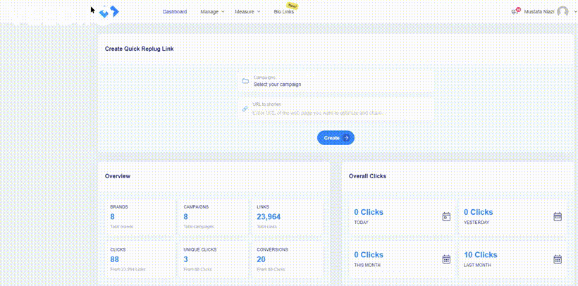
Replug is a great option. It lets you create custom, branded links and provides detailed analytics, including total clicks, unique clicks, geotargeting data, device info, browser, OS, and referral sources, to help you measure and improve performance.
How do branded QR codes help increase CTR?
By turning branded links into QR codes, you give users a quick and seamless way to access your content, especially in offline settings like events, packaging, or signage. A familiar brand in the URL builds trust and boosts the likelihood of a scan and click.
The sky? Calm? Maybe “Monday blues”, or something cool and refreshing?
Now think “Red”.
How do you feel?
In danger? Energized? Bold? Maybe even a little anxious?
See what just happened?
Colors don’t just look different; they feel different. They shape how we perceive, react, and decide. In marketing, that’s where color psychology steps in. It’s a quiet force, often overlooked, but it speaks louder than you might think.
And that brings us to a crucial question: Can something as small as your call-to-action button color really influence clicks?
YES! It can.
At first glance, it might seem like a minor design choice. But it’s not. Color quietly guides what users notice, how they feel, and what they do next. The numbers back this up: 60% of people decide whether to accept or reject a product based on color alone. And consistent brand colors can increase recognition by up to 80%.
But what makes a CTA button color work?
Is it as simple as using red for urgency and blue for trust? Or is there more behind the choices?
In this blog, we’ll explore what color psychology tells us, share real-life CTA button examples, and talk about how to choose colors that fit your brand and audience.
Boost your conversion rates with irresistable CTAs with
Why call to action button color matters for website conversion
When you’re working to improve website conversion, it’s easy to focus on things like copy, layout, or adding eye-catching visuals. But, your call to action button color can quietly play a bigger role than you might expect. After all, your CTA button isn’t just a design element; it’s what guides your visitors toward the next step, whether that’s signing up, buying, or learning more.
Colors influence what catches our eye first, how we feel about a brand, and how confident we feel about taking action. Research suggests that colors can even affect our heart rate, sense of urgency, and trust, all of which directly impact conversion optimization efforts. That’s why something as small as a CTA button can help increase CTR and maximize your conversion rate when chosen thoughtfully.
Think of it like this: your CTA button is the tipping point between browsing and converting. And while great copy helps, the right color makes that message stand out.
Just imagine a bold orange “Start free with email” button on a white landing page. It’s almost impossible to miss, isn’t it?
Choosing a color that contrasts with your background, fits your brand, and aligns with your audience’s preferences can make all the difference.
Now, let’s look at call to action button color psychology and explore how certain colors can trigger specific emotions and behaviors.
Call to action button color psychology: How colors influence user behavior
Call-to-action buttons may look simple, but there’s deep psychology behind what makes people click. Colors tap into emotions, perceptions, and even gender or cultural preferences. For instance, research shows women often prefer purple, green, and blue, while men lean toward blue, green, and black.
But choosing the right color isn’t just about emotion. It’s about strategy.
Your button must stand out from the background, reflect your brand tone, and stay consistent across your site. A color that pops in one layout might fade in another. A bold red may scream urgency on a white background but vanish into a dark hero image.
Also, cultural context matters. White means mourning in China, while in Greece, it’s purple. Brand identity plays a role too: playful orange might feel off on a luxury brand, while elegant black could be too intense for a kids’ site.
In short: color doesn’t just decorate, it directs. And when chosen wisely, it quietly nudges users to take action.
Put theory into action with Replug
Now that you know how much a button color can impact user behavior, here’s the real question: how do you bring this to life on your own pages?
Replug has a custom CTA generator that helps you design high-performing CTA overlays and bridge pages that align with your brand. You can personalize every detail; text, colors, logos, button placement, and layout, so your CTAs feel intentional and not generic.
Whether you’re using red for urgency or blue for trust, Replug gives you full creative control to test, tweak, and convert:
Button color, size, and placement
Backgrounds, layout, and design
Targeted messaging that connects with the right audience
If you’re ready to stop guessing and start converting, Replug gives you the tools to make every CTA count.
Boost your conversion rates with irresistable CTAs with
You’ve seen how colors can influence action, but just picking red or green isn’t enough. Here are a few best practices to make sure your CTA buttons actually convert:
Contrast is key
Your button should stand out, not blend in. Make sure it contrasts clearly with the background and surrounding elements.
Stick to one primary CTA color
Don’t overload your page with multiple button colors. Choose one primary action color and stick to it for consistency and clarity.
Test what works for your audience
Color psychology is powerful, but it’s not one-size-fits-all. A/B test your CTA colors to see which one actually gets more clicks.
Use a customizable CTA generator
Use a CTA generator tool like Replug to design CTA buttons with full control over colors, fonts, and layouts. This way, your CTAs will always feel on-brand and eye-catching.
Get inspiration from the best brands
Look into how top brands craft their CTA buttons. Pay attention to color, text, and placement, and take notes on what grabs your attention.
Pair color with strong copy
Even the most vibrant button won’t convert if the copy’s vague. Use action-driven text like “Get Started”, “Try it Free”, or “See How It Works.”
Make it mobile-friendly
Your CTA should be big enough to tap and look just as good on mobile screens as it does on desktop.
Now that we’ve doubled down on why the color of your call-to-action button matters and how to customize it using Replug, we’ve handpicked some of the best CTA button color examples for you. These real-world examples will give you a visual understanding of how different colors guide user perception, and how smart brands use them to drive clicks, signups, and sales.
Ready to pick your favorite?
Scroll down and see which CTA makes you want to click!
10 best call to action button colors (and when to use them)
So, what is the best call to action button color?
Marketers, designers, and honestly, entire Slack channels have debated this endlessly. But the answer isn’t as simple as “red always wins” or “blue builds trust.”
Let’s break it down, color by color, with what psychology and research actually tell us:
1. Red: urgency, excitement
Red is bold, loud, and great when you need to shout. It sparks urgency, perfect for flash sales, limited-time offers, or “Get Started” buttons. Also, red has been shown to increase heart rate.
When to use: Short-term offers, countdowns, or high-energy campaigns where you want quick clicks.
When to skip: If your brand is about calm, trust, or luxury, red might feel too aggressive or stressful.
Examples:
Coca-Cola:Shop Collection — red evokes excitement and brand passion.
Netflix:Get Started — red hints at bold entertainment and immediacy.
Green is reassuring. It whispers “Go ahead, it’s safe,” which is why it’s often used on checkout buttons or anything health-related. It’s tied to nature, wellness, and even prosperity.
When to use: Moments where you want users to feel comfortable and reassured as they take the next step.
When to skip: If your site already has a lot of green, your button might fade into the background.
Examples:
Postnitro:Start creating free carousels — calm encouragement to begin.
Evernote:Get Evernote free — signals progress with a peaceful touch.
Blue is a crowd favorite. 57% of men and 35% of women rank it as their top color. It feels secure, stable, and reliable, which is why banks, SaaS tools, and corporate sites love it.
When to use: Professional services, information-heavy sites, or brands built on credibility.
When to skip: In food-related spaces (blue can suppress appetite) or when you want a more emotional, warm vibe.
Examples:
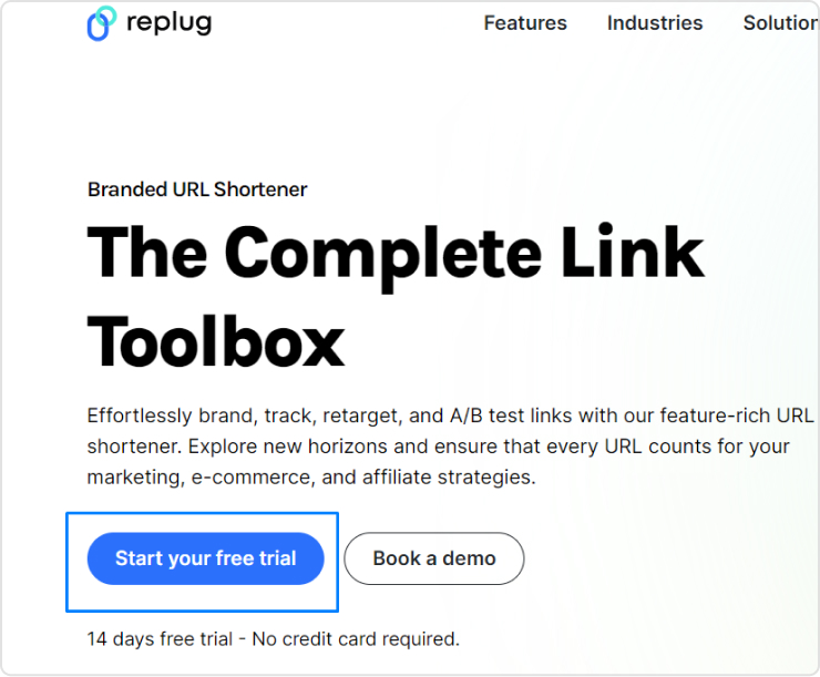
Replug:Get your short link for free — stable, reliable call to action.
ContentStudio:Start your free trial — builds user confidence.
Orange is energetic and playful, combining red’s urgency with yellow’s cheerfulness. However, about 29% of people rank orange as their least favorite color. It can feel cheap or off-brand in serious contexts.
When to use: Playful brands or when you want fast engagement without feeling too aggressive.
When to skip: Luxury products or serious industries where a more premium feel is needed.
Examples:
HubSpot:Get a demo — warm and inviting for curious prospects.
The Budgetnista:Take the 60 sec quiz — quick and casual engagement.
5. Yellow: Bright, optimistic, and grabs attention
Yellow pops off the page and brings a sunny, cheerful energy. It’s hard to miss, which is great for catching eyes. But too much yellow can feel overwhelming or even cautionary, like a warning sign.
When to use: Secondary actions, highlights, or to draw attention to updates and offers.
When to skip: As your main CTA color. It can strain the eyes or create tension if overused.
Examples:
charity: water:Join now — optimistic urgency for a cause.
Mailchimp:Start preview — energetic but not overwhelming.
Black buttons look powerful and stylish, especially for fashion, luxury, or tech brands. About 28% of famous companies use black as their brand colors for a cutting-edge feel.
When to use: Premium product lines, minimalist designs, or when you want to add weight to your button.
When to skip: Friendly, casual brands or spaces where black might come off as too harsh or impersonal.
Examples:
Contentpen:Start with 3 free articles — sharp and direct.
Typeform:Get Started — it’s free — stylish and professional.
Grey doesn’t compete for attention, making it ideal for secondary actions. It’s balanced and professional but easily blends into the background if not used carefully.
When to use: Supporting buttons, disclaimers, or actions that don’t need the spotlight.
When to skip: As your main CTA color, it can feel dull or signal a disabled state.
Examples:
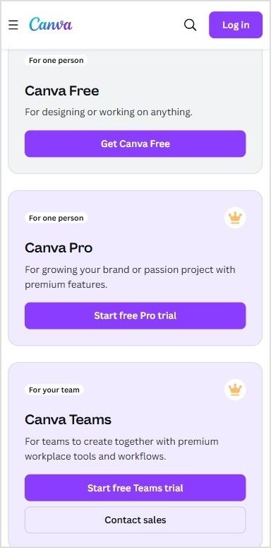
Canva:Read more — clear, but not dominant.
Etsy:Shop these unique finds — blends into a creative backdrop.
White lets other design elements shine. It creates a sense of space and minimalism when used well. But too much white can create visibility issues, especially with low-contrast backgrounds.
When to use: High-end, airy layouts or when your background is dark and you need something that pops.
When to skip: White-on-white designs or when the overall feel risks being too sterile or lifeless.
Examples:
M&M’s:Personalize your M&M’S — lets color pop on the page.
Apple:Watch the clip — sleek, distraction-free experience.
Warm colors like red, orange, and yellow can create urgency and excitement.
Cool colors like blue, green, and black often build trust or feel premium.
There’s no single “best color,” only the best choice for your brand, audience, and context.
What experts say about CTA button colors and conversion optimization
If you search online for the “best call to action button color”, you’ll quickly find lots of strong opinions, and sometimes, conflicting advice. Some marketers swear by red for urgency. Others love green for its calm and positive feel. And plenty argue that blue builds the most trust.
So, who’s right?
Experts often fall into three camps when it comes to conversion optimization:
The generalizers: They share broad best practices, like “warm colors grab attention” or “contrast your button against the background.” These tips help, but they don’t always explain why certain colors resonate more with specific audiences.
The pigeonholers: They believe there’s a secret formula, a single “winning” color that always boosts conversions. But, what works for one brand or campaign might not work for another.
The perpetual testers: They focus on experimenting over and over. For them, there’s no one-size-fits-all answer. The real key is trying different button colors, tracking what drives clicks, and refining based on results.
The truth is, your call to action button color does matter, but context is everything. Replug users often run A/B tests on their landing pages to see which one performs best – and call to action button colour can be a potential variable as to why only one landing page is worth keeping.
For instance, some audiences might click more on a bold orange “Learn More” button, while another responds better to a calm blue “Get Started.” This testing-first mindset is what often helps brands increase CTR and see the real impact of color on your conversion rates.
There isn’t a single color that works perfectly for every product or audience. Instead, it’s about choosing a color that fits your brand, contrasts well with your design, and feels right to your target users.
Wrapping it up
The right CTA button color can catch the eye, stir emotion, and even nudge someone to click.
But there’s no one-size-fits-all formula.
Your brand, audience, and goals should guide your palette. Want trust? Try blue. Need urgency? Red might do the trick. Going for luxury? Maybe black.
So, test, tweak, and trust your data. And don’t be afraid to break the “rules” if it works for your people.
Because at the end of the day, it’s not just about color psychology; it’s about connection.
Boost your conversion rates with irresistable CTAs with
There’s no fixed palette, but popular CTA button colors include red (urgency), green (go), blue (trust), orange (excitement), and black (luxury). The best color depends on your brand vibe and what action you want people to take.
What is a good color for a button?
A good button color stands out from your background and matches your message. Red and orange work well for urgent actions, while green and blue feel more calm and trustworthy.
What color attracts people to click?
Red and orange tend to drive the highest click-through rates in many tests. But ultimately, the most “clickable” color is one that contrasts well and aligns with user expectations on your site or campaign.
What is call-to-action button color psychology?
CTA button color psychology is the study of how different colors influence people’s decisions to click. For example, red can create urgency, blue builds trust, and green signals success. Choosing the right color can improve conversions—when done with context in mind.
Sharing useful content is part of every marketer’s daily routine; whether it’s an insightful article, a trending video, or a how-to guide your audience will love, But what if, instead of stopping there, you could guide your audience toward the next step you want them to take; right on top of the content you share? That’s where call-to-action overlays come in.
Boost your conversion rates with irresistable CTAs with
In this blog, we’ll explore what CTA overlays are, how they work, why they’re powerful, real examples, templates, best practices, and how tools like Replug make creating call-to-action overlays simple, even if you don’t code.
What are call-to-action overlays?
A call-to-action overlay is a small, non-intrusive, and interactive pop up or banner (like a CTA banner or CTA button) that appears over content.
These overlays act as interactive prompts, encouraging users to:
Keep your brand visible even when sharing third-party content
For example, if you share an article about marketing trends, your CTA banner could invite readers to download your free eBook on the same topic.
With tools like Replug, you can add CTA overlays in minutes, turning every shared link into an opportunity to capture leads.
How do call-to-action overlays work?
You start by selecting a call-to-action generator like Replug; a tool that not only lets you add customizable call-to-action banners and pop-ups but also tracks clicks to see what’s working best.
Next, you:
Pick the content you want to share. It can be anything; an article, video, or guide that your audience will find useful and engaging.
Design your overlay. This could be a button, banner, or form featuring a short message and a clear call to action, like “Subscribe now” or “Get the free guide.”
Replug makes it easy to brand these overlays with your logo, colors, and style, so every shared link becomes a subtle marketing asset that drives traffic back to your website or landing page.
How to create call-to-action overlays with Replug
Adding CTA overlays with Replug is quick and doesn’t need any coding. Here’s how:
Step 2: Create a new CTA from the campaign section
Step 3: In the “Call-to-action” tab, select your button style (or call-to-action overlay).
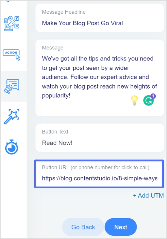
Step 4: Click “Next”. Type in a catchy headline, message, button text, and link URL (or phone number) for your CTA campaign.
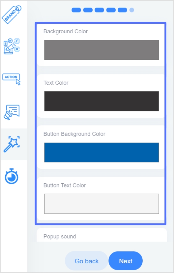
Step 5:Customize the look. Pick a colour palette or adjust it yourself by changing the background, text colour, and tweaking the appearance.
In just a few minutes, you’ll have a branded pop up, exit intent, banner, or social classic/modern CTA button ready to add to any shared link, helping you drive traffic to your landing page, collect leads, or promote special offers.
Boost your conversion rates with irresistable CTAs with
Keeping your brand visible, encouraging ongoing engagement, linking to social or special pages
With Replug, adding these CTA overlays to your shared links is simple. You can turn every pop up, banner, or social classic/modern CTA button into a powerful tool to guide visitors back to your landing page, newsletter, or offer.
Best practices for designing effective CTA overlays
Your call-to-action (CTA) overlay isn’t just a button or banner; it’s the make-or-break moment between a visitor and a conversion. A few thoughtful tweaks can turn a passive visitor into an active user.
Here’s how to get it right:
Keep it clear and actionable
Use verbs that make the next step obvious: “Download your free ebook now,” “Start free trial,” or “Get my exclusive discount.” Avoid vague CTAs like “Click here” or “Learn more,” as they don’t clearly communicate the benefit to the user.
Add your official contact information
Include your business email, phone number, or website so people know the overlay is legitimate and can easily reach you.
Make it stand out but stay on-brand
Your CTA overlay should catch the eye without clashing with your overall design. Use contrasting colors that draw attention, while still fitting within your brand palette. Rounded corners and subtle shadows can also make buttons feel more inviting and clickable.
A call-to-action overlay should be large enough to notice, but not so large it feels overwhelming. Place it above the fold and repeat it after key sections or at the end of longer pages, so visitors always have an opportunity to take action without scrolling back.
Test different variations
Small changes, like updating text from “Sign up” to “Join free,” or adjusting the button color, can affect conversion rates. Use A/B testing to see which combinations work best for your audience.
Create a sense of trust and urgency
Adding phrases like “Secure checkout,” “Limited offer,” or “Offer ends today” helps encourage faster action and reassures users about the safety of their information.
Keep it concise
CTA text should typically stay between two to five words. Short, direct messages have more impact and are easier for users to process quickly.
Tip: If you’re using tools like Replug to add CTA overlays to curated content, apply the same best practices: clear copy, contrasting design, and strategic placement. This will guide users toward your goal effectively.
Examples of call-to-action overlays
Here are some examples of the different types of call-to-action overlays:
Need a little spark to write your overlays? Here are real-life inspired CTA overlay templates or CTA button templates you can copy, tweak, and make your own. From popups to banners and scroll boxes, these aren’t your typical “click here” buttons; they’re punchy, playful, and crafted to get real clicks.
Scenario
Overlay type
Template (headline + message + CTA button)
Sharing a trending industry article
Popup
Headline: “Get our free 2025 social media checklist!”Message: “Stay ahead of trends with proven tips.”CTA button: “Show me the secrets”
Sharing a product review blog
Banner
Headline: “Limited-time offer!”Message: “Use code SAVE10 for 10% off your first purchase.”CTA button: “Yes, I want the deal”
Sharing a whitepaper or report
Banner
Headline: “Need expert advice?”Message: “Book a free consultation to grow your business.”CTA button: “Let’s make a plan”
Sharing a YouTube video
Social modern
Button text: “Send me fresh tips”
Sharing a lifestyle blog
Exit intent
Headline: “Wait! Don’t miss this deal.”Message: “Sign up now and get 10% off your first order.”CTA button: “Unlock my discount”
Sharing a blog on productivity hacks
Scroll box
Headline: “Want to work smarter?”Message: “Book your free strategy call today.”CTA button: “Yes, boost my workflow”
Call-to-action overlays transform every piece of shared content into a conversion tool.
Whether you’re driving traffic to your landing page, collecting emails, or promoting offers, CTA overlays keep your brand in the spotlight, even on third-party content.
Tools like Replug make adding CTA banners, popups, and buttons effortless, helping you capture more leads without extra effort.
They’re small popups or banners that appear over content, prompting users to take action (e.g., click, subscribe, visit a landing page).
Why don’t CTA overlays work on every website?
Some websites like Facebook, LinkedIn, or most Google pages, use iframe restrictions to protect their content. This means they don’t allow their pages to be displayed inside another page. When this happens, tools like Replug offer an option to create a summary page. Instead of showing the original site directly, your audience sees a branded page summarizing the content, along with your CTA overlay.
Can I customize the design of my call-to-action overlay?
Yes! With tools like Replug, you can change text, colors, and CTA button styles to match your brand.
What is the best practice for CTA placement?
Place CTAs where they naturally fit into the user journey: above the fold, at the end of content, or triggered by user behavior (like scrolling or exit intent). With call-to-action overlays, you can place them to appear as popups, banners, or scroll boxes, so they stay visible without being disruptive.
Are call-to-action overlays compatible with all content?
In most cases, yes! Call to action overlays are compatible with blog posts, articles, YouTube videos, product pages, and landing pages. Some sites may block iframe-based overlays, but you can counter this by creating a bridge page using Replug.
What is an example of a call to action?
A simple example: “Subscribe to get our free weekly tips.”
As a call-to-action overlay, this might appear as a banner over an article you share, or as an exit intent popup inviting visitors to sign up, keeping your message front and center even when sharing external content.
Is a CTA always a button?
Not always! While CTAs often appear as buttons because they’re clear and clickable, they can also be banners, text links, floating widgets, or popups, especially when used as call-to-action overlays on shared content.
What’s the difference between a CTA banner and a popup?
A banner stays at the top or bottom of the page, while a popup appears in the center or corner, often for email capture.
Every marketing message needs a final spark; a clear, direct step that turns a passive visitor into an active customer. This is where the CTA, or call to action, plays its part. By guiding your audience from curiosity to action, it helps increase engagement and turns interest into measurable results.
But what is a CTA in marketing, and why does it matter so much?
In this blog, we’ll look at what CTA stands for in marketing, explain the difference between soft CTA and hard CTA, look at powerful CTA examples in marketing, explore practical tips, and how tools like Replug help you create a CTA that increases your conversion rate.
Boost your conversion rates with irresistable CTAs with
CTA stands for call to action. In marketing, it’s what tells your audience what to do next, like “buy now”, “subscribe”, or “download”.
The call to action marketing definition is simple: it’s about guiding your audience from just looking to actually doing. CTAs appear as buttons, hyperlinks, banners, or even phrases in videos and emails. They might be as direct as “start free trial” or as gentle as “discover more”, but their purpose stays the same: lead people toward action.
CTA in marketing: why it matters
What does CTA mean in marketing? It means turning curiosity into clicks, and clicks into measurable business results.
Think of your content as a conversation. Without a CTA, that conversation stops short; you’ve sparked interest, but you haven’t shown what to do next. Effective CTA marketing bridges that gap. It keeps visitors engaged, increases your ROI, and helps you guide each person through the customer journey, from awareness to consideration and finally to decision.
In other words, CTA in marketing isn’t just about adding a button; it’s about creating a clear path your audience wants to follow.
Types of CTAs: soft CTA vs. hard CTA
Successful marketing often uses a mix of soft CTA and hard CTA, matched to where your audience is in the funnel.
Type
What it does
Examples
When to use
Soft CTA
Encourages low‑commitment, exploratory steps
– Learn more – See how it works – Discover more
Early stages: Building trust and educating
Hard CTA
Pushes for a final, decisive action
– Buy now – Subscribe – Download now
Later stages: When your audience is ready to convert
Using both keeps your CTA marketing natural: soft CTAs spark interest; hard CTAs convert that interest into results.
How to create an effective call to action for marketing?
There are many tools out there to help you craft a compelling call to action as part of your marketing strategy. However, Replug stands out because it offers a custom overlay creator designed to simplify the entire process.
Inside Replug, you can create a dedicated CTA campaign, choosing your message, button text (buy now, subscribe, or any custom copy), and styling it to match your brand’s look and feel. You can also create dynamic CTAs that adapt based on your audience or campaign goals, helping you keep messaging fresh and personalized without starting from scratch.
Moreover, you can decide where your CTA appears: as a pop‑up, using a banner template, or even on a bridge page when direct overlays aren’t supported on platforms like Facebook or Google.
Boost your conversion rates with irresistable CTAs with
Crafting CTAs isn’t only about writing clever text; it’s about understanding what will truly motivate your audience to act.
Start by knowing your goal
Before writing your CTA, decide what you want to achieve. Are you trying to get sign‑ups, drive direct purchases, or increase downloads? A clear goal ensures your CTA aligns with your content and your business strategy.
Use action‑oriented language
Strong verbs like “start”, “discover’, “join”, “buy now”, or “subscribe” add energy and clarity. They don’t just tell users what to do; they help them feel ready to do it.
Focus on benefits, not just actions
People click when they see what’s in it for them. Instead of “submit”, try “get your free guide”. This approach shifts attention to the value your offer provides.
Design for visibility
A CTA button should catch the eye without overwhelming the design. Contrast with surrounding colors, add whitespace, and keep fonts bold yet clean.
Strategic placement matters
CTAs don’t always belong only at the bottom. Try placing them after product descriptions, in blog posts, or as exit pop‑ups. Replug even lets you add branded CTAs on curated content you share, so every link becomes part of your funnel.
Note on platform restrictions Some digital platforms like Facebook, Google, or YouTube restrict adding custom CTAs directly due to iframe or embed policies; which can be frustrating for users, especially affiliates. To work around this, you can use Replug to create a bridge page: a branded intermediate page that appears before the final destination. It hosts your CTA, so you still guide users to act, even when the original site doesn’t allow it.
Users often skim online. A short, direct CTA like “shop the collection” or “download” now usually outperforms longer, complex phrases.
Use CTAs in bio links and captions
Add CTAs to Instagram bios, TikTok profiles, and captions to drive clicks. With tools like Replug, you can turn one bio link into a branded landing page with multiple CTAs. Perfect for affiliates and creators who want to track every click.
Phrases like today, “limited‑time offer”, or “don’t miss out” gently nudge users to act sooner rather than later.
Test, learn, repeat
Use analytics and A/B testing to see which CTA marketing ideas resonate most. Even a single word change can move your conversion rate.
Great CTA marketing is an ongoing process: set clear goals, test, learn, and refine.
Benefits of using the right CTA
A well‑planned CTA strategy does more than increase clicks. It transforms how your audience experiences your brand:
Guide visitors to act with confidence: Clear, well‑placed prompts remove hesitation. When visitors know exactly what to do next, they’re more likely to take action; whether that’s buy now, subscribe, or download.
Focus on real value, not just clicks: Effective CTAs highlight what matters most to your audience: exclusive access, discounts, or helpful content, turning curiosity into meaningful engagement.
Track performance and refine your strategy: With tools like Replug, every click can be tracked. This means you see which CTAs get real results, run A/B tests, and keep improving your conversion rate over time.
Add CTAs even where platforms restrict them: Some platforms (like Facebook, Google, or YouTube) limit direct CTAs because of iframe or embed restrictions. Replug solves this by letting you create customizable bridge pages.
Build brand trust through consistency When your CTAs match your design and tone everywhere, from emails to shared links visitors feel a seamless brand experience. This consistency builds confidence and makes users more comfortable saying yes.
Boost ROI with branded URLs!
Enhance your marketing campaigns by creating shareable, trackable, and fully multi-purpose
customizable branded URLs.
When using a CTA in digital marketing, what works best isn’t always obvious. That’s why A/B testing (also called split testing) is essential: it helps you compare two or more versions of a call to action to see which performs better and drives more conversions.
Split testing allows you to test different elements like copy, color, size, placement, or design, to identify the most effective combination for engagement and conversions.
For example, you might test:
Buy now vs. Get yours today
Button color or size
Placement at the top, middle, or end
Bold button vs. simple text link
By systematically running these experiments and analyzing the data, you make data‑driven decisions instead of relying on guesswork. Over time, you can refine your CTAs by iterating on successful variations and discarding the ones that don’t perform.
Tools like Replug make this process easier: you can quickly create multiple CTA versions, track clicks, and see what resonates best with your audience. That way, your CTA marketing strategy keeps improving, backed by real insights rather than assumptions.
Start crafting CTAs your audience wants to click
Using a CTA in your marketing campaigns isn’t just about telling people what to do. It’s about creating a moment that moves them from interest to action.
Using right wording, placement, and tools like Replug, you can craft CTAs that feel authentic and turn passive visitors into loyal customers.
FAQs about CTA marketing
What does CTA stand for in online marketing?
CTA stands for Call to Action. It’s any prompt that directs your audience toward a desired action, like buying a product or signing up for updates.
What is an example of a CTA?
A CTA (call to action) can be as simple as “Buy now,” “Subscribe,” “Learn more,” or “Download your free guide.” It’s any prompt that encourages the audience to take a specific next step.
What are the disadvantages of a CTA?
If used poorly, CTAs can feel pushy, repetitive, or off‑brand. Overusing them may overwhelm visitors, while unclear or generic CTAs can confuse rather than guide, leading to lower conversion rates.
What is a CTA button in marketing?
A CTA button is a clickable element designed to stand out and prompt users to act. For example, adding an item to a cart, subscribing to a newsletter, or starting a free trial.
Is there a tool to create and test CTAs easily?
Yes. You can use tools like Replug to design, customize, and test CTAs across your marketing campaigns. It lets you create CTA campaigns, run A/B tests, track performance, and even add CTAs to shared links, including bridge pages when direct overlays aren’t supported on platforms like Facebook or Google. This makes it easier to refine what works and keep your branding consistent.
How do CTAs impact SEO?
While CTAs themselves don’t directly change your search ranking, they guide users to engage more deeply with your site. This can reduce bounce rates, increase time on page, and send positive user signals to search engines.
What does CTA mean on Instagram?
On Instagram, a CTA could be text in a caption like “Tap the link in bio,” stickers in Stories such as “Swipe up,” or buttons like “Shop Now” that encourage immediate engagement.
Ever wondered why some calls to action make you want to click without a second thought? That’s the magic of a well-crafted call to action – it feels like it’s speaking right to you, not at you. You want something catchy, inviting, and, most importantly, something that gets people to click!
But where do you start?
A great CTA isn’t just about “Sign up” or “Buy now”; it’s about finding the words that connect with your audience and make them want to take that next step. Whether you’re trying to boost sales, build your email list, or just get people to check out your latest content, the right CTA can do wonders.
In this post, we’ll walk through some of the best CTA phrases that’ll help you engage your audience in a way that feels natural and, most importantly, gets results.
Sound good? Let’s get calling!
100+ best call-to-action phrases
A call to action is used in all marketing funnels of the customer journey. We’ve categorized the types of call-to-action phrases into 10 types:
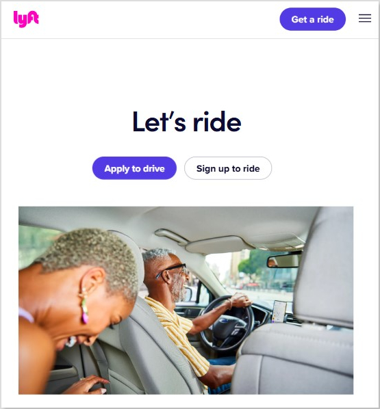
Why it works: A no-fuss approach that says, “You’re already part of the family—come on in and pick up where you left off.” or even better, if you’re not a part of the family, it gives new users the option to try the tool for free!
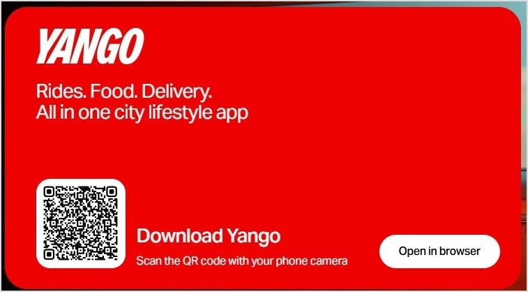
Why it works: This CTA makes downloading a breeze with a QR code and a clear option to open in the browser, making it convenient and accessible for any user.
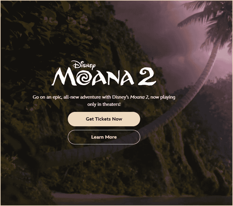
Why it works: Simple, urgent, and exciting—this CTA taps into the anticipation of Moana 2 and encourages users to get their tickets for the movie through the website.
Why it works: By linking directly to a number, this CTA offers a quick and effortless way to connect, making the sales conversation fast and accessible.
Examples of download resources CTAs
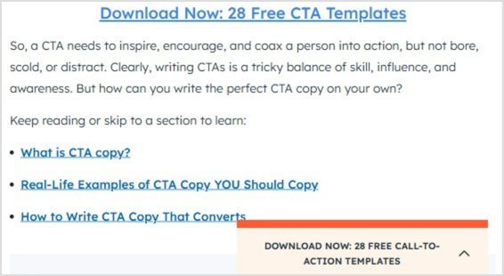
Example #1: Hubspot – Download now: 28 Free CTA Templates
Why it works: Playful and on-brand, this CTA invites users to dive into Old Spice’s humorous and bold world, making reading feel like an adventure worth taking.
Examples of user-benefit CTAs
Example #1: Harvard Health Publishing – I want to get healthier
Why it works: Playful and relatable, this CTA creates a sense of camaraderie, inviting users to share in a fun and social experience with their friends.
Example #4: Coursera – Black Friday ‘Save $160 now’
Why it works: Puts the fear of missing out to good use, urging shoppers to act before the exclusive 20% offer slips away.
Creating irresistible call-to-action phrases: tips to boost engagement
A well-crafted call to action (CTA) can be the difference between a casual visitor and a loyal customer. Here’s how to design CTAs that boost ROI, and drive clicks and conversions:
Use action-oriented verbs: Your CTA should start with clear, action-driven words like shop, download, subscribe, or start. These words prompt the user to act and guide them on what to do next.
Evoke emotion and urgency: Create a sense of excitement or urgency with phrases like “plan your dream vacation today” or “limited-time offer”. This taps into the fear of missing out (FOMO) and encourages immediate action.
Highlight the benefit: A strong CTA should focus on what the user gains. Phrases like “sign up for 50% off” or “start your free trial” let users know the value they’ll get, making them more inclined to click.
Keep mobile users in mind: On mobile devices, your CTAs should be short and direct. Use phrases like “call now” or “join today” that are easy to tap and act upon. For desktop, options like “learn more” or “get started” may be more effective as they can be slightly longer.
Add numbers to create clarity: Specificity helps build trust. A CTA that says “order now for 1-day shipping” or “subscribe for 3 exclusive reports” sets clear expectations, making users more likely to follow through.
Test and refine: Creating great CTAs is a continuous process. A/B test different variations to understand what wording, placement, and design resonate best with your audience. Small adjustments can lead to significant improvements in engagement.
With these strategies, you can create CTAs that capture attention, resonate with your audience, and drive meaningful interactions.
Bonus: What NOT to do
Avoid overhyping: Phrases like “Change your life forever!” can be off-putting if not backed up.
Avoid jargon: Complex language confuses rather than compels. Keep it simple and clear.
Don’t force decisions: Negative CTAs, such as “No thanks, I hate saving money,” can be off-putting.
Be specific: Phrases like “Click here” are vague. Be direct about what users will get.
Avoid misleading promises: Don’t use CTAs that exaggerate results, like “Instant success guaranteed.”
How to generate catchy call-to-action phrases using Replug?
The in-built CTA canvas is easy to use and helps you create pop-up CTA or button CTA from scratch. You don’t need any designer or technical knowledge to create one.
Replug creates branded CTA in seconds and broadcasts them anywhere across the web to catch potential leads that will boost your conversions.
It will also help you manage all your CTA data from a user-friendly dashboard to track progress: display, view, conversion, and clicks. Here’s how:
Go to the Replug App. If you don’t have an account, sign up.
Create a “New campaign”
Give your campaign a name and connect your custom domain.
Select “Call-to-action” and click “Next”
Generate your CTA (button, link, form). You’ll have multiple options to choose from.
Generate the message you want to convey through your call-to-action-phrase
Customize your CTA (colour palette and appearance)
CTAs guide your audience toward taking action, boosting engagement, and improving conversions.
How do I pick the right CTA for my content?
Know your audience’s needs and where they are in the buyer’s journey, then choose a phrase that connects with them.
What’s the key to writing the best call-to-action phrase?
A great call-to-action phrase is action-oriented, clear, and specific, without being pushy or vague. You can generate free call-to-action phrases using Replug’s free CTA generator.
Can humor be used in call-to-action phrases?
Yes, if it aligns with your brand, humor can make your CTA stand out and feel more relatable.
Should I include a CTA in every piece of content?
Yes, especially if you want to guide your audience to the next step. Just be sure it fits naturally.
How can I create urgency in my CTAs?
Use phrases like “Limited time only”, “Act now”, or “Don’t miss out” to encourage immediate action.
How do I measure if my call-to-action phrase is effective?
Track key metrics such as click-through rate (CTR), conversion rate, and user interaction to assess performance. Replug gives you the option to easily track the performance of your campaigns.
You’re running an e-commerce store with top-notch products, vibrant themes, detailed listings, and genuine reviews. Coupled with high-end SEO and social media marketing campaigns.
Everything seems in place, but your conversion rates need to hit the mark. Then what’s the missing piece? Let us clue you in – it’s the absence of an advanced call-to-action tool!
Using an advanced call-to-action tool can make all the difference by converting your website visitors into paying customers.
With strategic placement and catchy texts, CTAs compel users to take specific actions. Which ultimately helps you in boosting brand revenue potential.
Still confused? Don’t worry guys. In today’s blog, we’re covering everything from the finest CTA tips to the most cutting-edge CTA tools. Let us get you started.
What’s a CTA?
CTA stands for “Call to Action”. It’s an instruction that tells your audience what you want them to do next. These are commonly found in marketing and advertising but can be used anywhere you want to guide users toward a specific action.
What is a good call-to-action example?
A good example of a call-to-action is a clear and simple statement that tells users what to do next. For example, ContentStudio’s CTA “Try it for free” invites users to explore the tool without any commitments.
Best call-to-action tips to use
1. Try to use action verbs
Action verbs are the powerhouse behind persuasive CTAs. They prompt users to take immediate action, driving them toward the desired goal. Incorporate dynamic verbs like “discover,” “explore,” or “get” to instill a sense of urgency and motivation in your audience. Grab attention, Drive action!
Communicate the value proposition clearly in your CTAs. Highlight the benefits or rewards users will receive by clicking through, whether it’s accessing exclusive content, unlocking special discounts, or gaining valuable insights. The more value users perceive, the more likely they are to act.
3. Create FOMO
Creating a sense of FOMO (Fear of Missing Out) is a potent tactic to drive action. Hint at limited-time offers, exclusive deals, or upcoming events to instill urgency in your audience. By suggesting that time is running out, you motivate users to act quickly to seize the opportunity.
4. Use fancy graphics and colors
Visual appeal is key to capturing attention and enticing clicks. Incorporate eye-catching graphics, vibrant colors, and captivating imagery to make your CTAs stand out. Choose visuals that align with your brand identity and message while grabbing the user’s attention.
Experiment with unique shapes or sizes for your CTAs to make them visually appealing and memorable. Whether it’s a bold button, a playful icon, or a custom design element, think outside the box to create CTAs that stand out and invite interaction.
6. Keep the text brief
Keep your CTA text concise and to the point. Avoid overwhelming users with too much information. Instead, focus on conveying your message succinctly, highlighting the key action or benefit users should take.
7. A/B test multiple CTA’s
Don’t settle for the first iteration of your CTAs. Experiment with different variations, including text, design, placement, and color scheme, to identify what resonates best with your audience. A/B testing allows you to optimize your CTAs for maximum effectiveness and drive better results over time.
Top call to action tools to use
1. Replug
A complete link management solution
for marketing professionals & agencies.
Try Replug for free
Our top favorite is Replug – a powerful link management platform that allows users to create branded short links, track click data, and retarget audiences across various digital channels.
In terms of CTA generation, Replug enables users to embed call-to-action (CTA) overlays or pop-ups on shared links, directing traffic to desired landing pages or offers.
You can obtain detailed information about your website traffic, including the country, browser, device, and date, giving you precise insights into your audience.
HubSpot’s CTA tool is part of its comprehensive marketing automation platform, designed to help businesses attract, engage, and delight customers. With its CTA tool, users can create visually appealing CTAs that seamlessly integrate with their website or email campaigns.
Moreover, these CTAs are strategically placed to prompt visitors to take desired actions, such as downloading a resource or requesting a demo.
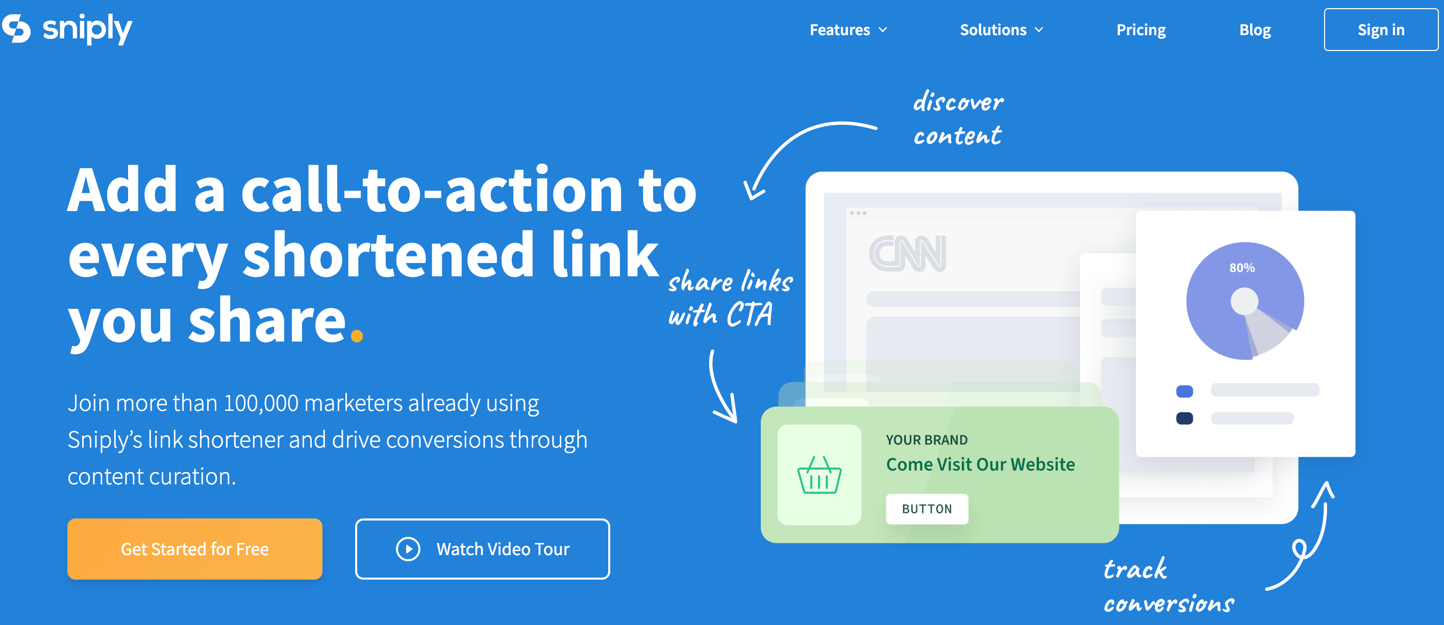
Sniply is a unique tool that allows users to add custom messages or CTAs to any web page they share, even if they don’t own the page.
Users can create branded Sniply links that drive traffic back to their own website or landing pages. This CTA generation method leverages shared content to capture leads and drive conversions.
Scalenut
Scalenut is an AI-powered content marketing platform that helps businesses create, distribute, and optimize content at scale.
The platform offers a free CTA generation tool. By understanding user intent and preferences, Scalenut assists in generating CTAs that resonate with target audiences.
Canva is a versatile design platform that empowers users to create stunning graphics, presentations, and marketing materials with ease.
While not a dedicated CTA tool, Canva provides users with the tools to design eye-catching CTAs that complement their branding and messaging. Users can create custom graphics or templates for CTAs to be used across various digital channels, from social media posts to website banners.
Things to consider when choosing your CTA tool
Here are some of the most important things to consider when choosing your CTA tool.
Consider your budget: Free options offer good basic functionality, while paid tools might have advanced features like A/B testing or performance analytics.
Think about your needs: Do you need a simple CTA builder or a tool with AI-powered suggestions? How important is customization for you?
Read reviews and comparisons: Researching user experiences can help you find a tool that works well for others in your situation.
Maximize marketing ROI
by transforming ordinary URLs into branded short links that convert.
Try Replug for free
The best CTA generation tool is no other than Replug. This is because:
Easy to Use: Replug doesn’t require coding knowledge. Get a free CTA builder specifically designed to craft compelling CTAs with customizable text, buttons, forms, and pop-ups.
Targeted CTAs: Replug allows you to define your target audience during CTA creation. This ensures the CTAs you build resonate with the specific user group you’re aiming for.
A/B Testing: Replug integrates A/B testing so you can track CTA performance and see which variations drive the most conversions. This data-driven approach helps you continually optimize your CTAs for maximum impact.
Retargeting capabilities: It enables users to maximize conversions by embedding CTAs directly within shared links, ensuring targeted audiences are directed to relevant landing pages or offers.
Overall, Replug’s combination of advanced features and ease of use makes it ideal for businesses looking to drive engagement and conversions effectively.
FAQs
What is an example of a call to action in AI?
AI can analyze vast amounts of data to understand user behavior, preferences, and context, allowing businesses to tailor their CTAs for maximum impact.
Some of the common examples include:
Sign up today
Download now
See how it works
Join now
What is a strong CTA?
A strong CTA combines clarity, relevance, and urgency to compel users to take the desired action. It communicates the value proposition briefly and motivates users to act without hesitation.
What is a call to value instead of a call to action?
A call to value focuses on highlighting the benefits and value proposition offered to the user rather than explicitly instructing them to take action.
What is a secondary call to action?
A secondary call-to-action serves as an alternative action for users who may need more time to be ready to commit to the primary CTA. It provides additional options for engagement, such as downloading a resource, exploring related content, or joining a mailing list, catering to diverse user preferences and behaviors.
Whether you’re familiar with it or not, chances are most of us have encountered different types of calls to action while browsing websites or social media platforms.
For instance,
You might have clicked on a “Learn More” button and ended up landing on a page containing more information related to that topic.
Or you might have clicked on a “Buy Now!” call to action button that takes you to a product page or a similar web-page.
Now why do they matter?
CTA buttons matter as they point users towards a desired action.
Hence, the name of the term is “Call to Action”.
What is a call to action button?
A call to action (CTA) button is a clickable button or link on a website, advertisement, or piece of content that encourages the audience to take a specific action.
CTAs can drive a variety of different actions depending on the content’s goal, such as generating leads, making a purchase, or subscribing to a newsletter.
CTAs are crucial to generating leads from a website, and can help motivate visitors into deeper engagement with a brand.
CTA buttons are important because they act like helpful guides on your website, pointing visitors toward valuable content or actions that benefit both you and them. Here’s why:
Benefits for visitors:
Clarity: They tell visitors what to do next, eliminating confusion and helping them find what they’re looking for faster.
Convenience: They offer a one-click path to things like downloading resources, starting free trials, or contacting you.
Value: They highlight content or actions that can solve their problems or improve their experience.
Benefits for you:
Conversions: They encourage visitors to take specific actions, like signing up for a newsletter or making a purchase.
Engagement: They keep visitors actively interacting with your website and exploring what you offer.
Data: They provide valuable data about what actions users are most interested in, helping you make better decisions about your website content and marketing strategy.
Maximize marketing ROI
by transforming ordinary URLs into branded short links that convert.
Try Replug for free
Different types of CTA buttons to boost your CTR
CTA buttons can vary in style and size depending on your goal conversion and website style. Each type has a specific purpose and works best in different situations.
Let’s explore some common ones:
1. Lead generation:
Imagine offering a free e-book in exchange for an email address. Your CTA button could be “Get Your Free E-book Now!” and placed prominently near the e-book description.
2. Form submission:
This CTA helps gather visitor information, like “Sign Up for Our Newsletter” on a blog or “Tell Us Your Needs” on a contact page.
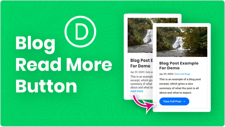
3. “Read More” button:
If you have snippets of longer content, this CTA encourages visitors to delve deeper, like “Read the Full Article” on a blog post preview.
This CTA leads visitors to explore your offerings, like “Browse Our Collections” on a clothing website or “Discover Our Services” on a marketing agency page.
5. Download now:
After someone signs up, a CTA like “Download Our Beginner’s Guide” keeps them engaged and learning more.
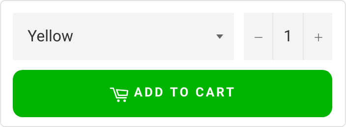
6. Purchase CTA button:
On product pages, a bold “Buy Now” or “Add to Cart” button prompts immediate purchase.
7. Demo/Trial CTA:
Let visitors try before they buy with CTAs like “Start Your Free Trial” or “Book Your Demo Today.”
8. Contact us:
Make it easy for people to reach out with a clear “Contact Us” or “Chat with Us Now” button.
8. Banner CTA
A Banner CTA, is a visually prominent element usually displayed at the top or within a webpage, often in the form of a banner or button. These banners are strategically designed to be eye-catching, fostering user engagement and interaction with the intended goal.
9. Social sharing CTA
Social sharing CTA, or Call to Action, is a prompt strategically placed on a website or social media platform to encourage users to share content, such as articles, images, or videos, with their network.
Best practices for designing an effective CTA button
Tell them what to do: Use strong verbs like “Download” or “Learn More.”
Highlight the benefit: What do they get by clicking? Free guide? Exclusive content?
Short and sweet: Keep the text easy to read.
Make it stand out: Use contrasting colors and good placement.
Mobile-friendly: Easy to tap on any device.
Remember, good CTAs guide users and improve their experience.
Bonus Tip:Replug is a tool that lets you design different types of CTAs like buttons, forms, and even pop-ups, without needing any coding skills. Plus, you can track how well your CTAs are performing to see what resonates with your audience.
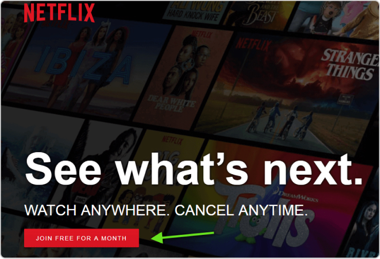
It is clear, concise, and gets straight to the point.
Because it’s:
Free: Who doesn’t love trying something new for free?
Limited: Only a month to explore, so dive in quick!
Easy: Joining = binge-watching heaven awaits.
No pressure: A month lets you try before you commit.
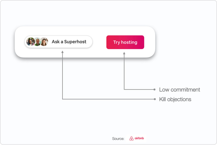
2. Airbnb: “Try Hosting”
This button taps into users’ curiosity and encourages exploration.
It is because;
Intriguing: “Try Hosting” piques curiosity without making a big commitment.
Open-ended: It invites users to explore the possibilities of hosting without pressure.
Low barrier to entry: “Try” suggests it’s easy to get started and see if hosting is right for them.
Overall, it’s a smart way to encourage people to consider being Airbnb hosts without feeling overwhelmed.
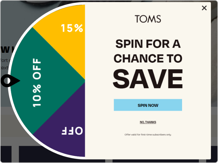
3. “SPIN FOR A CHANCE TO SAVE” – TOMS
The “Spin for a Chance to Save” technique used by TOMS can be an effective way to grab attention and spark interest, especially for younger audiences. Here’s why:
It is because;
Gamification: Spinning a wheel is a fun and interactive way to engage users, making them more likely to participate compared to just clicking a button.
Surprise and anticipation: The mystery of what someone might win adds excitement and keeps them invested in the process.
Potential reward: Even if the savings aren’t guaranteed, the chance to win something appealing can motivate people to try.
Remember, your CTA buttons are your website’s secret weapon. Craft them with care, and track your clicks (and conversions) soar!
FAQs
What is a call to action button behavior?
A Call to Action (CTA) button prompts users to take a specific action, such as making a purchase or signing up. Its behavior should be clear, compelling, and guide users toward the desired action.
What should a call to action button say?
CTA button text should be concise, action-oriented, and aligned with the desired action. Examples include “Buy Now,” “Sign Up,” or “Learn More.”
How do I create a CTA button?
Use Replug’s CTA builder to design and customize your button. Specify the action, craft compelling text, set the button link, define the target audience, and save and implement the CTA on your website.
Learn how to create irresistible CTAs to boost your brand’s visibility and multiply conversions.
This guide will show you the easy steps to leverage Replug’s magnetic feature for maximum sales impact. Let’s turn your clicks into conversions and elevate your digital success with Replug!
What is a CTA campaign in Replug?
In Replug, a Call-to-Action (CTA) campaign serves as a powerful message to showcase your deals, offers, and sales to your audience. By using CTAs, you can effectively broadcast your message and prompt your audience to take specific actions that lead to sales.
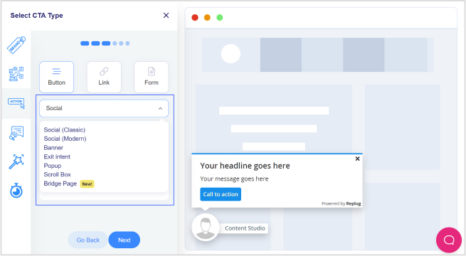
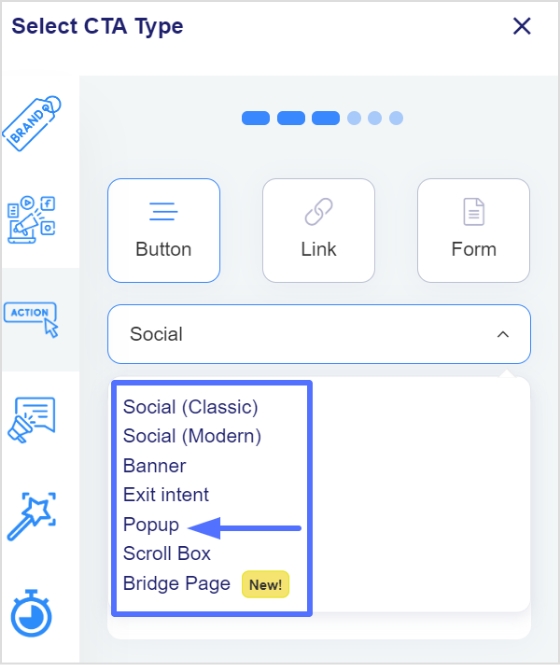
When you opt for the Call-To-Action feature in Replug, you encounter three distinct options in the subsequent step:
Button:
Ideal for redirecting visitors to your primary source, this option enables you to create a clickable button or link, providing a direct pathway for your audience to take the desired action.
Link:
Similar to the button, this option allows you to redirect visitors, providing flexibility in creating clickable links to guide your audience towards the intended action.
Form:
If your goal is lead collection, selecting the Form option is key. This choice enables you to integrate with various third-party Email Services for effective lead gathering.
Replug seamlessly integrates with several third-party email services, including but not limited to:
By understanding and leveraging these options, you can tailor your Call-to-Action campaigns in Replug to effectively engage your audience and drive the desired outcomes, whether it’s through clickable buttons, links, or lead collection forms.
Boost your conversion rates with irresistable CTAs with
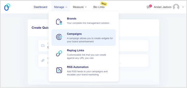
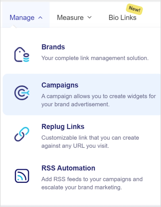
Step 2: Navigate to the Manage section on the main dashboard and click on “Campaigns.”
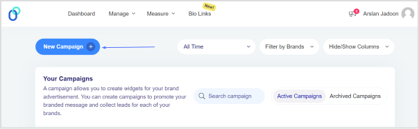
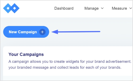
Step 3: Click the “Create New Campaign” button in the campaign section.
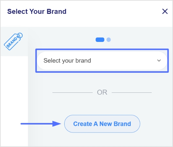
Step 4: Select or create a brand for your new campaign and click the “Next” button.
Step 5: Choose a name for your call-to-action campaign on the campaign type page.
Step 6: Select the Call-to-Action option and click “Next.”
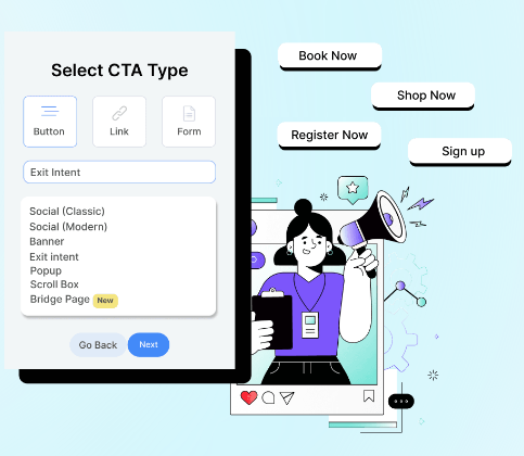
Step 7: Choose your CTA type (e.g., Link, Button, Form).
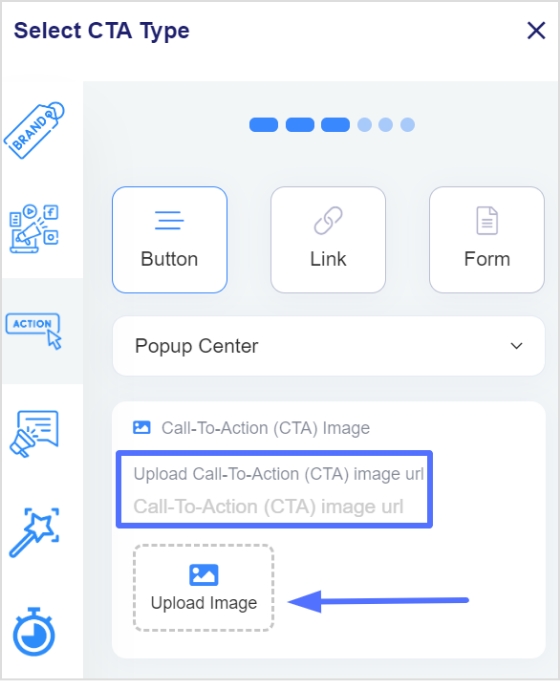
Step 8: Select a theme for your CTA; for example, you can choose a pop-up theme.
Step 9: Enter your URL, upload an image for the CTA, and click “Next.”
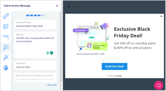
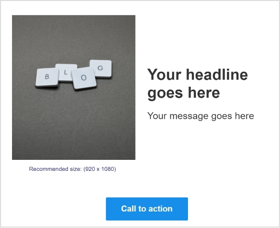
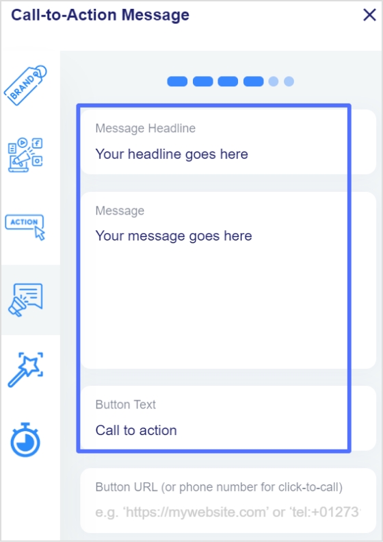
Step 10: In the CTA message section, write your headline, message, and CTA button text. Enter the URL for the CTA.
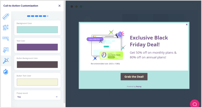
Step 11: Move to the CTA customization section, where you can add colors for the background, text, CTA button background, and CTA button text. Click “Next.”
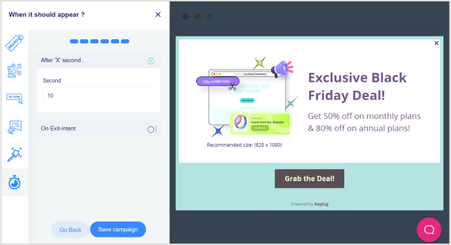
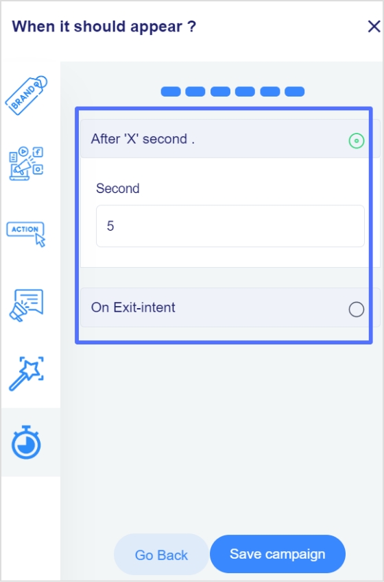
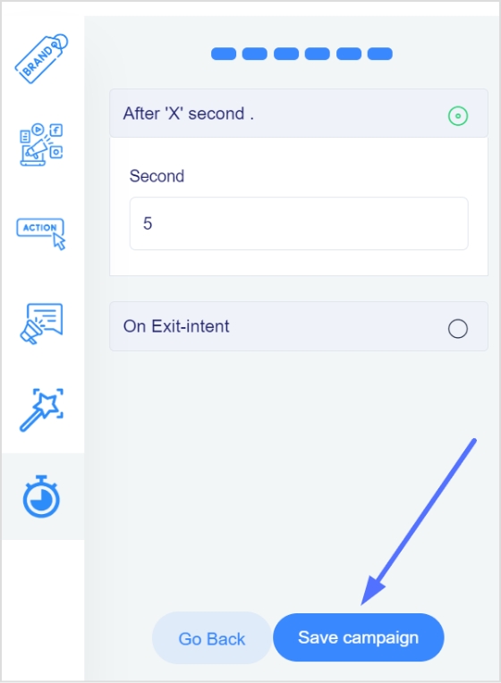
Step 12: In the final step, select the seconds after which the CTA will be displayed to the user. Alternatively, choose the “On exit-intent” option to display the CTA when the user intends to exit the page.
Step 13: Save the campaign.
Boost your conversion rates with irresistable CTAs with
Effectively monitoring your Call-to-Action (CTA) campaigns with Replug is crucial to ensure their success and optimize for better results. Here’s what to monitor and analyze using Replug:
Dashboard overview:
Gain instant insights into your campaign’s success with overall statistics, including Clicks, Unique Clicks, Conversions, and Conversion Rate, displayed prominently on your dashboard.
Clicks performance:
Delve into the performance of your CTAs by analyzing the Clicks metric. Understand how many users engaged with your call to action and track click trends over time.
Conversions performance:
Monitor the effectiveness of your CTAs by examining the Conversions metric. Track the number of desired actions taken by users and assess the overall success of your campaigns.
Visitors by browsers:
Understand your audience better by exploring the browsers they use. Identify popular browsers to optimize your CTAs for a seamless user experience across different platforms.
Visitors by operating system:
Gain insights into the operating systems your audience employs. Use this information to tailor your CTAs for compatibility, ensuring a smooth interaction on various devices.
Visitors by country:
Explore the geographical impact of your CTAs. Identify which countries are most responsive, allowing you to target specific regions more effectively.
Visitors by source/referrer:
Uncover the sources or referrers driving traffic to your CTAs. Determine the most successful channels and adjust your marketing strategy accordingly to maximize reach.
By leveraging these monitoring features provided by Replug, you can track the key performance indicators of your Call-to-Action campaigns. Whether it’s understanding user behavior, optimizing for different platforms, or targeting specific regions, Replug equips you with the data needed to refine and enhance your CTAs for optimal results.
Boost your conversion rates with irresistable CTAs with
How can Replug’s Call-to-Action campaigns benefit my business?
Replug’s CTAs can significantly enhance your brand’s visibility, multiply conversions, and maximize sales impact. The platform provides a user-friendly interface to create compelling CTAs tailored to your specific goals.
What types of CTAs can I create using Replug?
Replug offers versatile CTA types, including buttons, links, and forms. You can redirect users, collect leads, or guide them to perform specific actions based on your campaign objectives.
How do I track the performance of my Call-to-Action campaigns on Replug?
Replug provides comprehensive statistics, including overall clicks, unique clicks, conversions, and conversion rates. You can monitor performance trends, analyze clicks and conversions, and gain insights into visitor behavior.
Can I customize the appearance of my CTAs on Replug?
Yes, Replug allows you to customize your CTAs extensively. You can choose different themes, add colors to the background and text, and optimize the appearance to align with your brand identity.
What kind of analytics does Replug offer for my CTA campaigns?
Replug provides detailed analytics such as click heatmaps, device and location insights, and even integration with third-party analytics platforms. This allows you to make data-driven decisions for refining and optimizing your campaigns.
Can I use Replug’s CTAs for lead generation?
Absolutely! Replug offers a Form option where you can integrate with various third-party Email Services to collect leads effectively. Choose the Form type when creating your campaign, select your preferred email service, and start gathering leads seamlessly.
Creating a call to action using a URL shortener can effectively drive conversions and encourage users to take a specific action. Using a URL shortener to create a call to action has a few key benefits.
First, it can make long and complex URLs easier to share and more visually to appeal. Sharing a link in a social media post or on a platform with limited space for long URLs can be beneficial.
Second, URL shorteners can help to track clicks on a link, which can help understand the effectiveness of your call to action.
Finally, URL shorteners can make creating custom and branded links easier, which can help build brand awareness and make your link more memorable.
How to create a call to action using Replug?
Use these simple steps to create a call to action that inspires users to take action that will benefit your business or organization.
Step 1: Sign in to Replug or create an account if you’re new.
Step 2: Go to the manage section on the main dashboard page and select campaign.
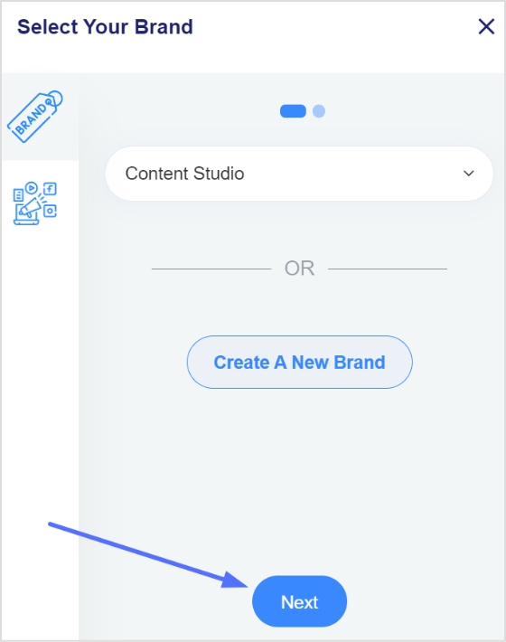
Step 3: Click on the “create new campaign” button in the campaign section.
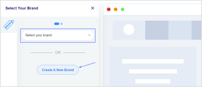
Step 4: To create a new campaign, you must select a brand first. You may choose an existing brand or create a new one if not already been created.
Step 5: Click the next button once you’ve selected or created a brand.
[branded_short_links]
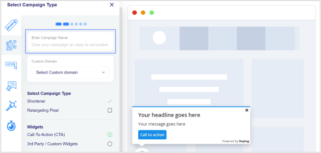
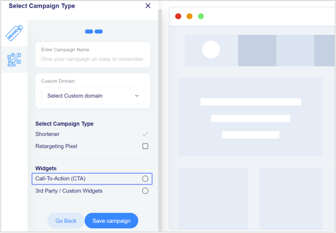
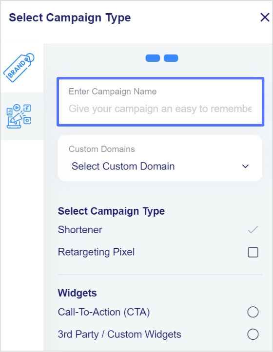
Step 6: You will now see a page for choosing a campaign type. Choose a name for your call-to-action campaign here.
Step 7: Select the call to action option from the campaign type page and click the next button.
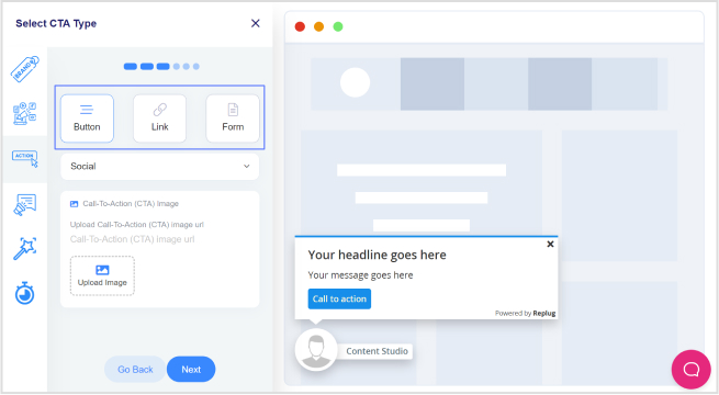
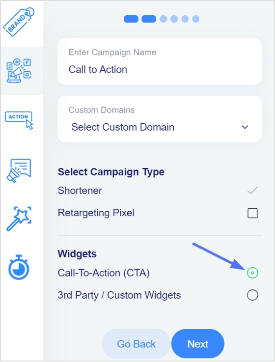
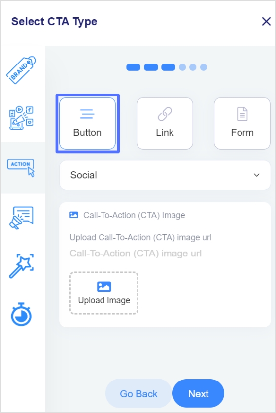
Step 8: Next, select your CTA type; here, we’ve selected a button CTA.
Step 9: After selecting the CTA type, you need to select the theme for your CTA. Your CTA’s appearance depends on your CTA’s purpose. As for this case, we have chosen a popup CTA theme to appear after clicking the shortened link.
Step 12: You are now in the CTA message section. Write your headline, message, and CTA button text.
Step 13: Enter your CTA button’s URL or phone numberin the last block, and click Next.
Step 14: You’re now in the CTA customization section, where you can add colors. (Background colors, text colors, CTA button background colors, CTA button text colors). Choose your colors and click next.
Step 15: In the final step, you will select the seconds, after which the CTA will be displayed to the user. Alternatively, you can select the “On exit-intent” option, which will display the CTA when the user wants to exit the page.
Step 16: Save the campaign; now, you can share it across other platforms. Ensure that your newly created campaign appears in the campaigns section.
Did You Know?
Replug can also help to track the effectiveness of the CTA, as it offers analytics tools that allow you to track how many clicks the CTA receives. This can help you determine which CTAs are most effective and optimize your marketing efforts accordingly.
FAQs
What are the 3 features of a strong call to action?
Any CTA should have these three key features:
Clarity: A strong call to action should be clear and straightforward so that the reader knows exactly what they are being asked to do. This means using actionable language, such as “click here” or “sign up now,” and avoiding vague or confusing phrases.
Urgency: A sense of urgency can be a powerful motivator, and a strong call to action should convey a sense that the reader needs to take action immediately. This can be achieved through time-sensitive language, such as “limited time offer,” “act now,” or by highlighting the benefits of taking action immediately.
Relevance: A strong call to action should be relevant to the reader and the context in which it appears. This means that it should be tailored to the specific needs and interests of the audience and should align with the overall goals and message of the campaign or piece of content. By focusing on the reader and their needs, a strong call to action can increase the chances of conversion.
What elements are in CTA?
There are a few key elements that are typically included in a CTA:
Action verb: The CTA should include an action verb that tells the reader what to do. Some common action verbs used in CTAs include “click,” “sign up,” “download,” and “register.”
Button or link: The CTA should include a button or link that the reader can click to take the desired action. The button or link should be prominently placed and easy to find.
Benefit: The CTA should include a benefit or reason for the reader to take the desired action. This could be a discount, exclusive content, or a chance to win a prize.
Sense of urgency: The CTA should convey a sense of urgency or time sensitivity to encourage the reader to take action immediately. This can be achieved through time-sensitive language or by immediately highlighting the benefits of taking action.
A call to action for social media is an untold success secret that top brands and influencers use it every day.The majority of the top-performing social media content usually has a strong call-to-action phrase.
No wonder the audience reacts to it quickly. I’ve got social media call-to-action examples to share with you. But, before I get to those examples, it’s essential to discuss the basics around call-to-actions that will come in handy.
Why do CTAs matter in social media marketing?
Social media marketing becomes dull if there is no activity whatsoever. The purpose of social media call-to-actions is to entice the audience to react to the message.
Social media success lies in the engagement process regardless of the social media platform. The reason CTAs matter in social media marketing is that they encourage the audience to respond to social media posts no matter what.
What elements should you include in your CTA strategy?
Here are the seven key elements that should be added to a CTA strategy:
Wittiness: A little bit of fun or excitement goes a long way
Appeal: An appealing message that attracts the audience right away
Shortness: A short and sweet copy that is understandable and catchy
Relevance: It should be related to the target audience in order to work
Clarity: It must help clarify the context of the story or event
Enticement: It must be enticing the audience to reply
FOMO: Sometimes, a fear of missing out also helps in conversion. Try using the urgency-factor in the CTAs.
Call to actions for social media
There is plenty to learn from the experts on social media in every area – CTAs are no exception. Take a look at some of the examples of call-to-actions for social media:
LinkedIn CTAs
LinkedIn is a top-tier social media platform, and ignoring this lead-generation machine would be a big mistake. When it comes to LinkedIn posting ideas, CTAs should be part of every social marketer’s LinkedIn content strategy. Below are some good examples of call-to-actions found on LinkedIn.
1. Amazon Web Services
Amazon Web Services (AWS) is a popular cloud hosting service that allows users to host websites and apps.
Let’s check their LinkedIn ad:
Why it works
The main copy of the ad states the message with clarity. It simply hits the bullseye by targeting web and app developers.
A plus point in this LinkedIn ad is that it tells the audience about getting started for free – the CTAs like “sign up for free” and “free trial” in the copy always bring attention.
The ad has a “learn more” call-to-action that drives visitors to the AWS sign-up page. Moreover, such CTAs push prospective customers one step further, especially if they’re on the fence.
If you are looking to track or disguise links that appear much friendlier to the online user, then Amazon link shortener is just the tool for you. It helps you optimize product URLs and turn them into trackable and easy to share short branded links.
Tip: Make most of your CTAs by using it with deep links to amplify marketing efforts by sending users directly to the in app content and trigger app installations to the users that have not installed the app on their smartphone devices.
2. Microsoft
Microsoft is a tech giant that sells software, operating systems, and gadgets.
Here’s Microsoft’s recent LinkedIn ad about financial institution’s guide to the public cloud:
Why it works
The crux of the message is clearly written in the white bold text on the ad. No fluff or detailed text.
The “download now” CTA on the ad banner symbolizes that there is an ad for a downloadable item. It hints to the target audience to look into it.
Microsoft’s marketing team smartly used the “download” call-to-action button on the ad to make it easier for the audience to decide and take action about downloading the public cloud guide.
3. LinkedIn Talent Solutions
LinkedIn Talent Solutions is a powerful recruitment tool available on the LinkedIn platform.
Here’s their LinkedIn ad:
Why it works
A brief yet meaningful introductory text on the ad steals attention immediately.
Short link at the end of the introductory text gives the audience a chance to explore it further.
A downloadable CTA tells the target audience to get their hands on the downloadable item.
Reliance Infosystems is a tech powerhouse that offers cloud hosting, network management, and IT security management services.
Take a look at their LinkedIn ad:
Why it works
The text on the ad image easily becomes overwhelming for the viewers unless it’s short and precise. Reliance Infosystems seems to be pulling this off quite well.
The dashboard picture of their software solution balances the whole thing. Pictures and vectors mostly help retain the target audience’s attention.
The sign-up call-to-action pushes the audience to take a leap.
5. LinkedIn Learning
LinkedIn Learning is an educational platform from LinkedIn. It provides users access to the platform through their LinkedIn accounts. Check out their LinkedIn ad:
Why it works
The most attractive part of this ad is the copy of the ad. It has a short yet catchy statement on the ad banner. Along with a strong CTA phrase, the “Learn more” CTA button persuades users to click and get more information.
A number or percentage on the ad copy immediately grasps the attention of the viewers.
The ad design is quite simple which shifts the focus toward the copy.
Twitter CTAs
Twitter may seem simple, but it has a lot to offer. All you need is to know how to capitalize on the attention. Here are some of the tweets from brands and influencers that are crushing it with their call-to-actions on Twitter:
Tweets allow to use a limited amount of characters. So link shorteners for Twitter help create short URLs that can fit into your tweets.
6. Canva
Canva is a popular online graphics designing tool for creating social media images, banners, and ads. Check out their tweet:
Why it works
The tweet from Canva vividly targets the organizations or companies with team members for their “Canva for teams” plan.
The simplicity of the tweet language ensures that readers keep on reading the two-paragraph tweet from them.
A call-to-action text at the end of the tweet makes it easier for the prospective audience to click through and land on the respective plan page.
7. Guy Kawasaki
Guy Kawasaki is an entrepreneur, investor, and adviser to startups.
I stumbled upon one of his recent tweets, and it’s worth mentioning here:
Why it works
A one-line tweet and the text body includes “7 lessons” – it surely rings the bell. People would like to take a sneak peek at the list of seven lessons even for a second. A good move, indeed.
A short URL is used very smartly – the tweet stays in just one line, which makes the short link more prominent and clickable.
A picture is added to the tweet just to weigh in on the organic reach. Pictures and images usually get more attention and organic viewership as compared to text-only social media posts.
8. Semrush
Semrush is a powerful SEO analysis and rank tracking software used by professional digital marketers around the globe.
Here’s one of their tweets mentioning SEO expert Barry Schwartz.
Why it works
The tweet from Semrush cashed in on the hot trend in the online marketing and SEO fields, which is the September core update 2022.
Semrush mentioned Barry Schwartz in the tweet, which is a fantastic engagement strategy and gets the attention of the audience.
A short and brief call-to-action directs visitors to the article, which makes it a perfect tweet from a social media engagement standpoint.
9. TV Guide
TV Guide is an entertainment portal that discusses TV shows and movies.
Take a look at one of their recent tweets:
Why it works
The tweet has a news update for Netflix fans. It announces the availability of the Witcher: Blood Origin TV series on Netflix.
The tweet is short and sweet with no fluff. Such social media posts get more attention as compared to hefty social media posts.
TV Guide wrote a simple yet attractive call-to-action for driving Twitter followers to the article.
10. PageFactory
Allison Seboldt is the developer of PageFactory – an online content publishing app for content management systems.
Check out her tweet:
Why it works
Allison’s tweet has an attractive text body. She kept it simple yet meaningful. Her tweet was about the announcement of PageFactory’s integration with the Webflow platform.
The second thing that fascinated me was the two-line explanation that summed up the whole tweet.
The call-to-action was clear, concise, and catchy – it pushes the audience to click and check out the website.
The video in the tweet took the announcement to the next level.
Tip: Along with CTA’s, use retargeting ads to retarget people who haven’t visited your website and win back your online customers.
YouTube CTAs
YouTube is the second most popular search engine on the internet. When it comes to call-to-action for social media, YouTube has an excellent real estate to offer for CTAs.
Shorten links and add CTAs to your Youtube links using a Youtube URL shortener.
Let’s take a look at a couple of YouTube influencers who are capitalizing on the call-to-actions on YouTube:
11. Epic Gardening
Epic Gardening is a well-known gardening brand that has a YouTube channel and a website. Let’s see how this gardening brand is using the call-to-actions on social media:
Why it works
Epic Gardening is using the video description for sharing the link. Since the video description is a place to find the detail about the video, the channel has a product link in the video description.
The channel is promoting the lemon plant through the link in the description – the video is also about the same plant. Therefore, relevancy is the key to generating sales.
The product link is in the first line of the video description, which makes the link more prominent.
12. Creative Explained
Creative Explained is a YouTube channel around gardening and life hacks made by Armen Adamjan. He is promoting an ebooks bundle deal and using his YouTube video descriptions to sell the bundle deal.
Take a look at the description of one of the recent videos on this channel:
Why it works
Armen mentioned his website address in the very first line to drive people to check out the deal next to the call-to-action.
This YouTube influencer used the naked URL of the bundle deal right below the call-to-action.
13. Meta for Creators
Meta for Creators is a platform built by Facebook with creators in mind so that they could meet, collaborate, and earn money online.
Check out their Facebook ad:
Why it works
The ad has a short and sweet introductory text, which catches the attention in a split second.
Meta for Creators used the “follow” in the introductory text and mentioned their Facebook page to grow followers.
They used the video to attract, engage, and convert the audience.
The ad also has a “Follow” CTA phrased button at the bottom to ensure that more people follow their Facebook page.
Tip: Use bio links tools for your Instagram, Facebook, TikTok and Twitter to drive more followers and conversions.
14. Compose AI
Compose AI is a browser extension that has powerful AI features to write speedy emails and messages. It works across multiple sites but is commonly used for Gmail.
Here’s the Facebook ad for Compose AI:
Why it works
The first and foremost is the circled “free” text in the ad copy, which immediately steals the attention.
The ad image showcases a snippet of how this tool works – it’s an excellent way of enticing the audience to try out the product.
The headline of this Facebook ad says, “Write 2X Faster for Free” – it’s a fantastic one-liner along with the download CTA at the bottom.
Tip: Automate your content publishing using social media management platforms and grow your reach.
15. Circle
Circle is a financial technology company that helps in financial transactions at a fast-paced using the power of USDC and Euro Coin.
Let’s take a look at their Facebook ad:
Why it works
Circle is cashing in on their ability to deal with USDC cryptocurrency in their Facebook ad.
The copy of the ad emphasizes the trustworthiness of the coin.
They also have a “learn more” CTA at the bottom to drive people to their website for more details.
Replug: How do CTAs work?
Replug is an all-in-one link management tool that creates branded short URLs with the ability to track link performance. Moreover, the additional features include deep links, custom domains, integrations, bio links, UTM codes, retargeting, and call-to-actions.
Here are the steps of creating a CTA using Replug.
Step #1: Create a campaign in Replug
Log in to your Replug account and go to the campaign section. Click on the “New Campaign” button to get started with creating a new campaign.
Step #2: Select your brand
The second step is to select the appropriate brand or create a new one just in case. Once you’re done with this, click the “next” button to proceed.
Step #3: Choose the CTA widget
The next up is the selection of the CTA widget. Since you’re creating a call-to-action with Replug, choose the “call-to-action” option from the widgets section.
Step #4: Opt for the CTA type
After selecting the CTA widget, choose the CTA type. You’ll see three options, such as a button, link, and form. Choose the required CTA type to proceed.
Step #5: Add a CTA message
Add a CTA message afterwards. If you opt for the CTA button option in step #4, you’ll have to input the message headline, message body, and button text.
Step #6: Customize the CTA
You can customize the CTA to match your company’s branding if you will.
Step #7: Adjust the appearance
Adjust the popup timing in the appearance settings to make sure that the CTA snippet appears the way you want it to appear.
Final thoughts on call-to-action for social media
Most people think of call-to-action buttons as green or yellow rectangular buttons that say “sign up” or “download” on the websites.
However, a call-to-action doesn’t necessarily mean a button. In fact, it could be a text, image, or emoji that navigates the audience or influences the visitors to take an action.
Since there is cut-throat competition on social media, it’s essential to use every tool available at your disposal to attract, engage, and convert the audience.
The call-to-actions for social media is surely something that could increase post visibility, clickability, and engagement across all social media platforms.
Don’t hesitate to alter your social media strategy by including tailored-made call-to-actions for social media to see how they turned out for you.
Reach out to us on social media and tell us how this tactic worked out for you because if it works, then you could always rinse and repeat.
FAQs
Here are some burning questions about social media CTAs that need to be answered:
Does every social media post need a call to action?
Social media posts with call-to-actions tend to perform better from an engagement standpoint. However, it’s not absolutely important to infuse a CTA every time you post on social media.
Some social media post types such as useful tips, personal stories, and case studies don’t require call-to-actions. Instead, they have to be authentic, helpful, and engaging.
What is a call to action on TikTok?
The commonly used call-to-action on TikTok is “link in bio” – it’s similar to Instagram. However, it’s a completely different story in the TikTok ads.
What is a call to action on Facebook?
Facebook allows URLs in the caption/introductory text on a post. Most social media users utilize short links on Facebook to drive the audience to their website or a different social media profile. It’s a popular social media tactic to capitalize on the attention.
What is a good call to action on Instagram?
A good call-to-action on Instagram means a CTA that grasps the attention right away. To make such a CTA, make sure that you’re reaching out to the right audience, sharing something relevant with powerful call-to-action such as free, get access, download now, grab it today, avail discount, early access, etc. Instagram link shorteners like Replug help create tracking CTAs and bridge pages that can redirect traffic to any webpage with a shortened URL that helps convert more.
What is a call-to-action hashtag?
It’s a type of hashtag that brands and organizations create that emphasizes taking action or encouraging the followers to perform a specific job. Sometimes, brands start a Twitter trend with a specific hashtag and pay influencers to use that hashtag for promotion.
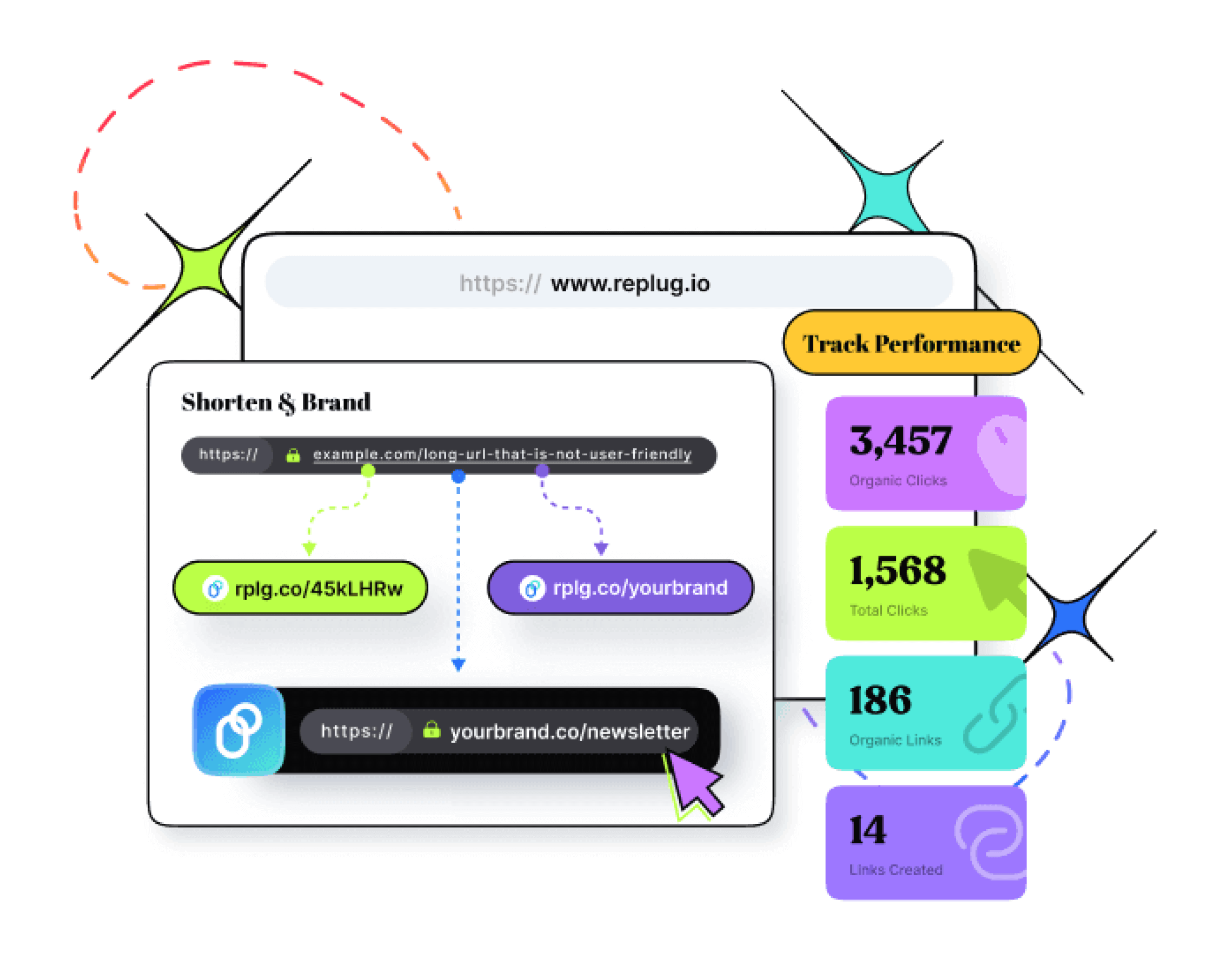
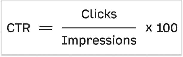


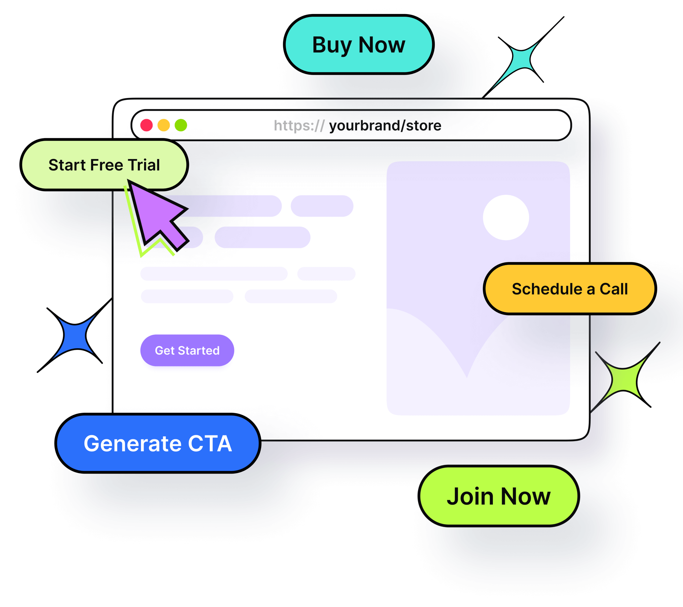


![Call-to-action overlays: Types, tips & templates [+ examples]](https://staging-blog.replug.io/wp-content/uploads/2025/07/What-is-a-call-to-action-overlay-1.jpg)
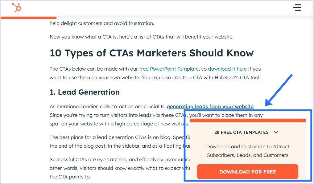


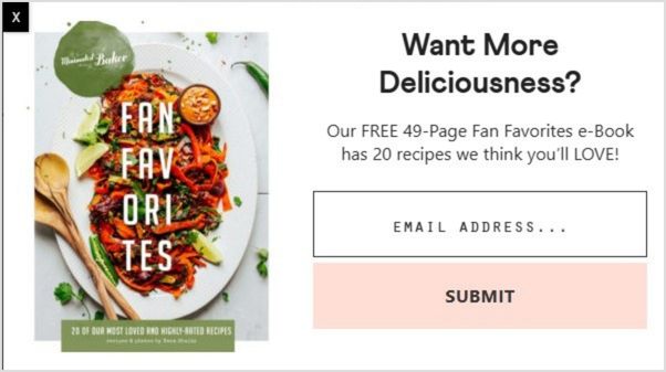


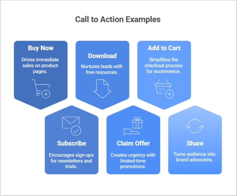

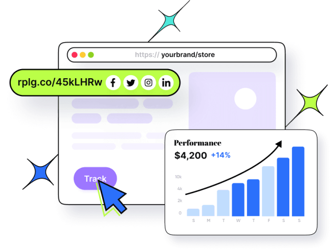
![100+ call-to-action phrases you NEED to use [+ best examples]](https://staging-blog.replug.io/wp-content/uploads/2022/09/call-to-action-phrases-1-1.jpg)